
Force of Nature. Period care without apology.
Context
Period care has long been built around discretion. Products are designed to manage menstruation quietly, communicated through clinical language and neutral design. As reusable period care began gaining traction, WUKA had the opportunity to move from challenger product to category leader. The existing brand no longer matched that ambition. It felt indistinct, visually tired and unclear in who it was speaking to, particularly for younger audiences entering the category for the first time, limiting its ability to expand confidently into mass retail.
Unlock
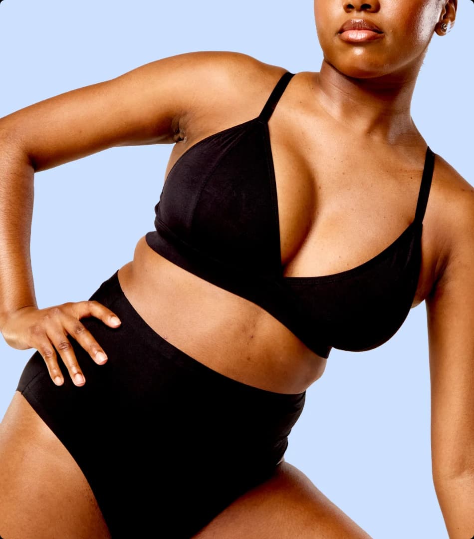
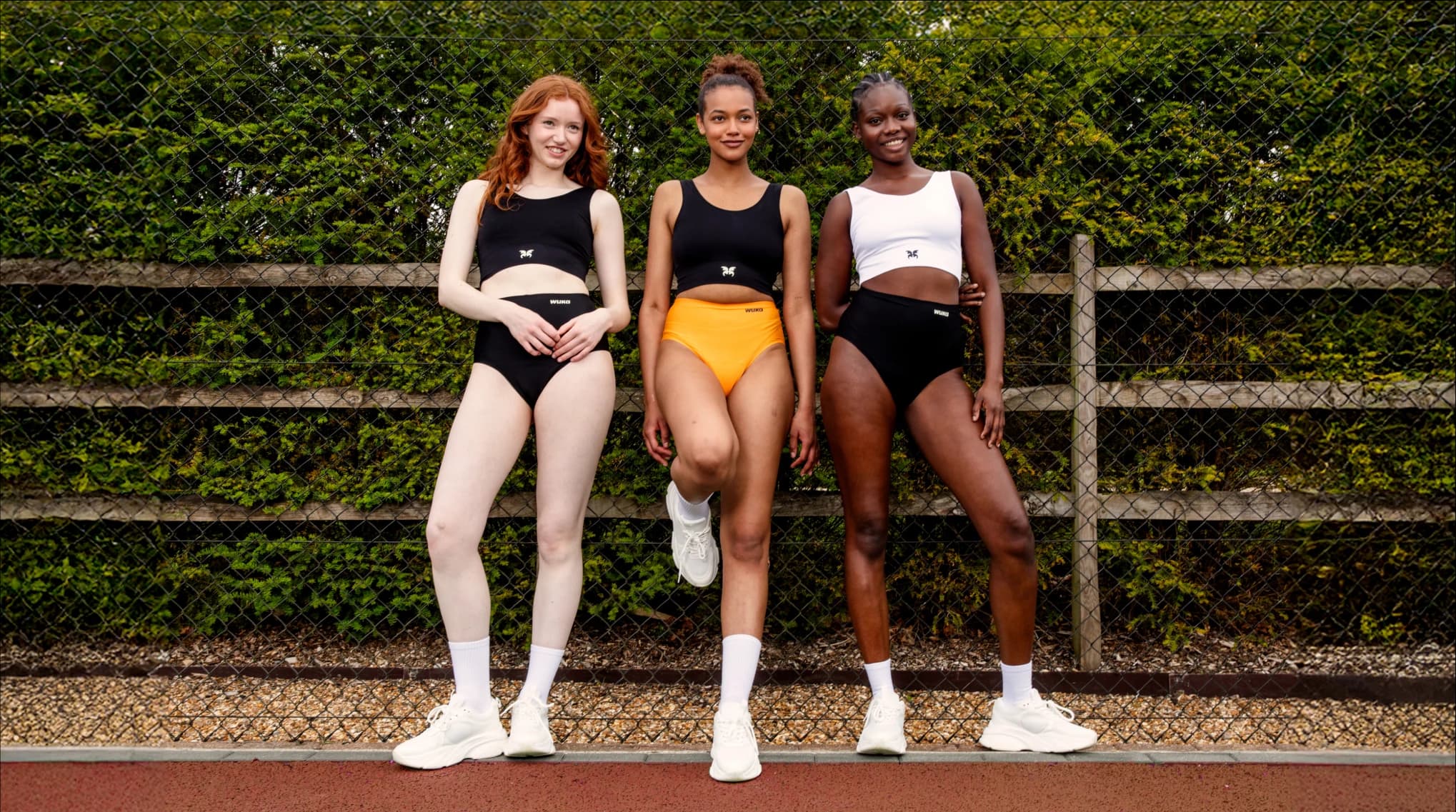
If periods are biological, the stigma around them is cultural and culture can change. That conviction became the organising idea: Force of Nature. Moving menstruation from something discreetly managed to something naturally powerful. The brand celebrates menstruation as something normal, visible and worth talking about. By rewarding openness, confidence and participation, WUKA lowers hesitation around first purchase and creates a brand people feel comfortable identifying with publicly.
Create
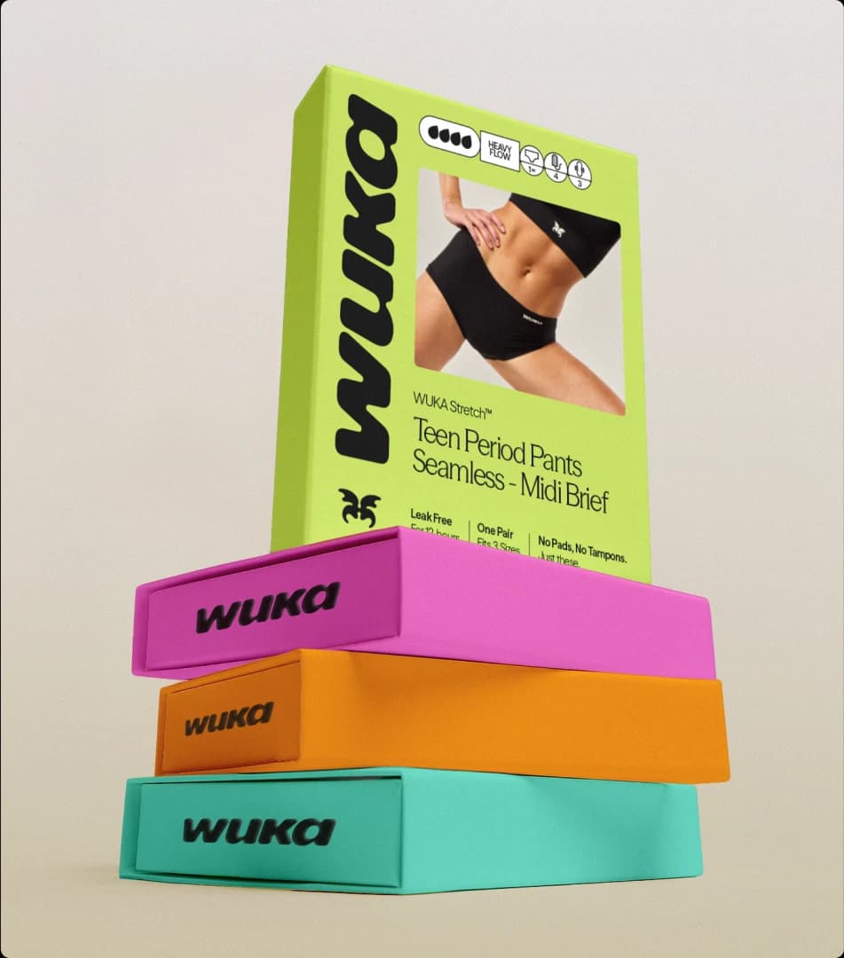
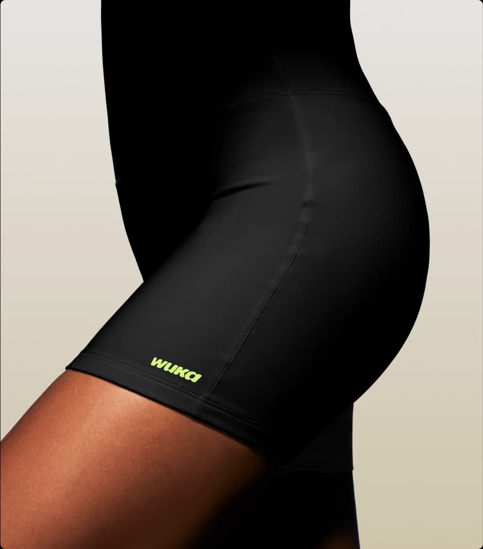
The brand system was built to carry that belief clearly across retail and culture. A confident typographic identity and bold visual language replace the category’s typical softness and euphemism, signalling strength rather than sensitivity. The idea of Force of Nature anchors the brand’s language, giving the system a clear message that travels across packaging, campaigns and community initiatives. A simple masterbrand architecture allows the range to expand across products and audiences while maintaining strong recognition on shelf.


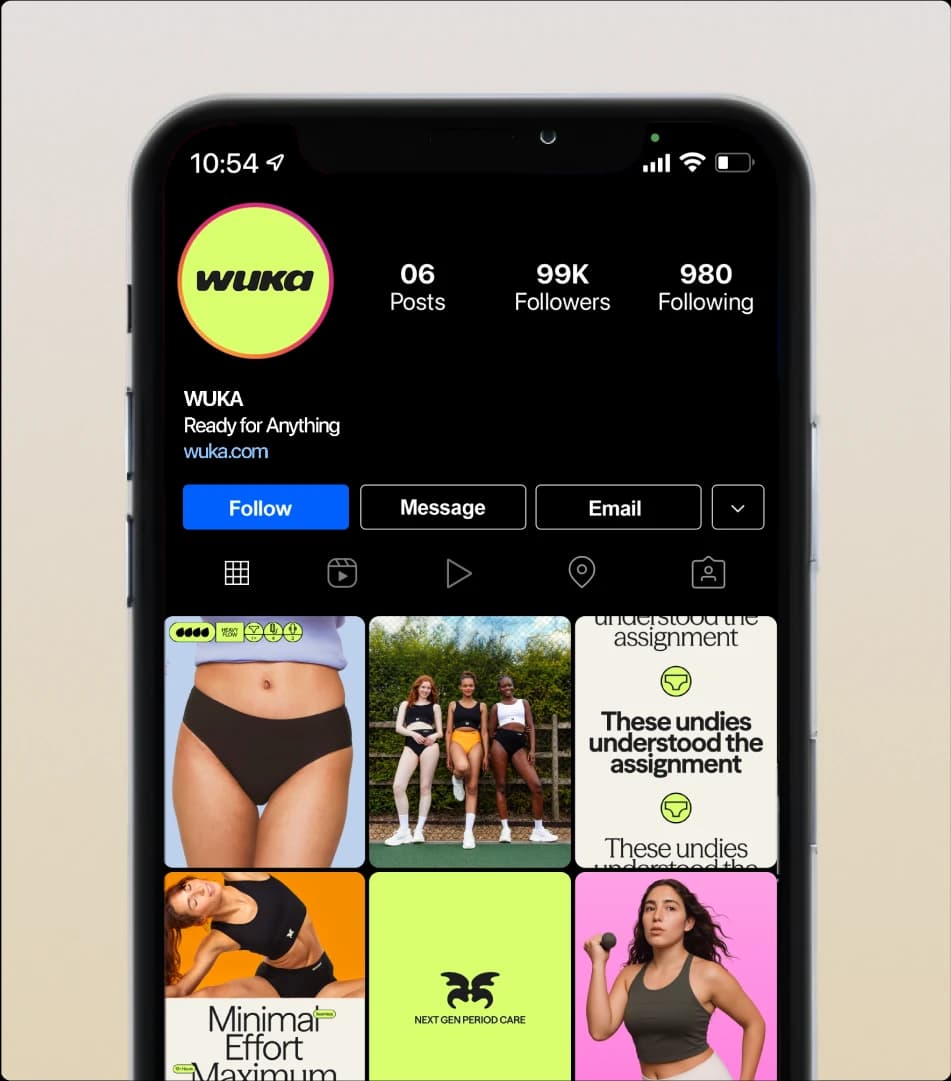
Become
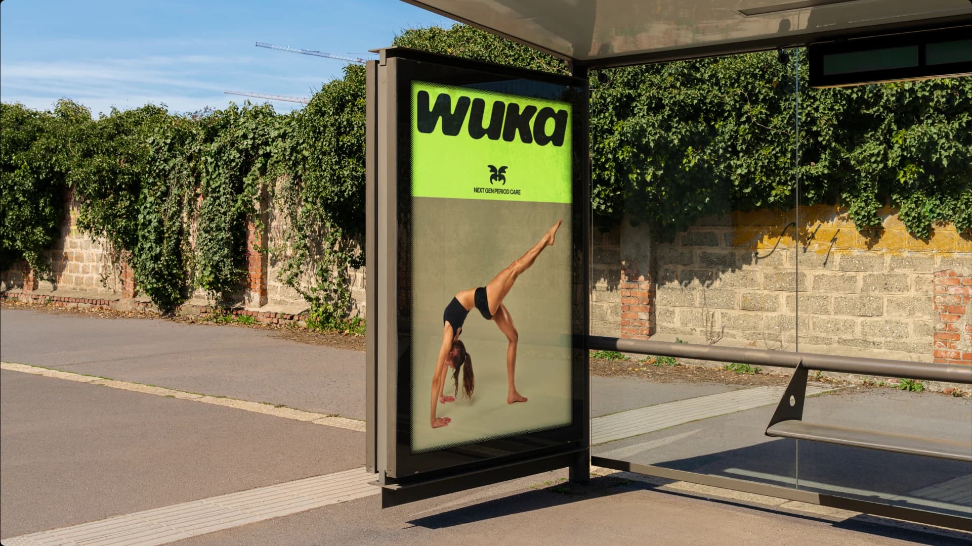
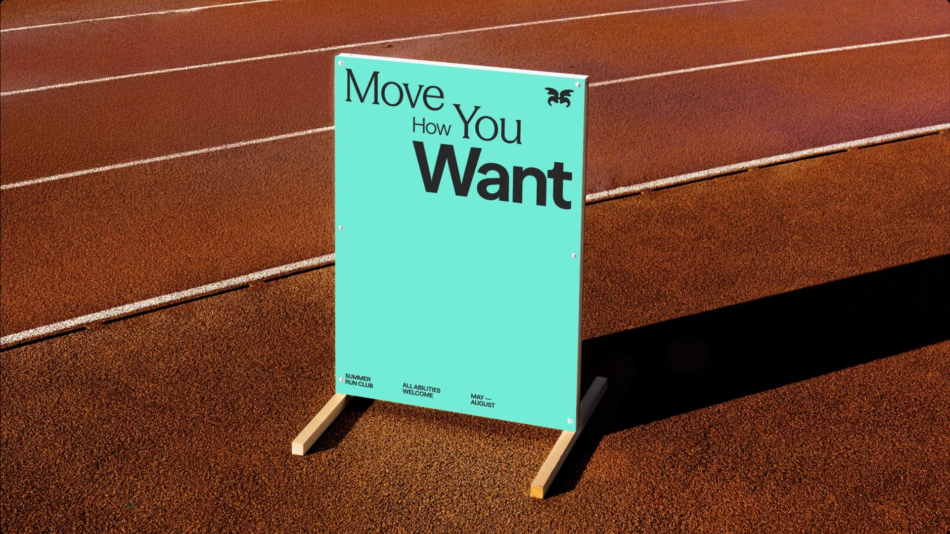
The brand now behaves as a cultural platform rather than a product label. In retail environments it appears clearly and confidently, helping the category feel more visible and less hidden. Beyond the shelf the brand supports initiatives encouraging girls to remain active in sport, reinforcing the belief that periods should never limit participation. The system allows this behaviour to scale as the business grows, keeping the core idea consistent while adapting across products, channels and partnerships.


Unmistakably WUKA
WUKA is recognised for speaking about menstruation without hesitation. Where many brands soften the category, WUKA takes a clear cultural stance rooted in pride and participation. This makes the brand difficult to confuse or imitate because the differentiation is not aesthetic. It is behavioural. The brand rewards openness and community, turning a functional product into a symbol of confidence.
Strategic Scope
Brand Strategy & Positioning
Brand Framework Development
Audience & Cultural Insight
Peer & Audience Testing
Brand Architecture
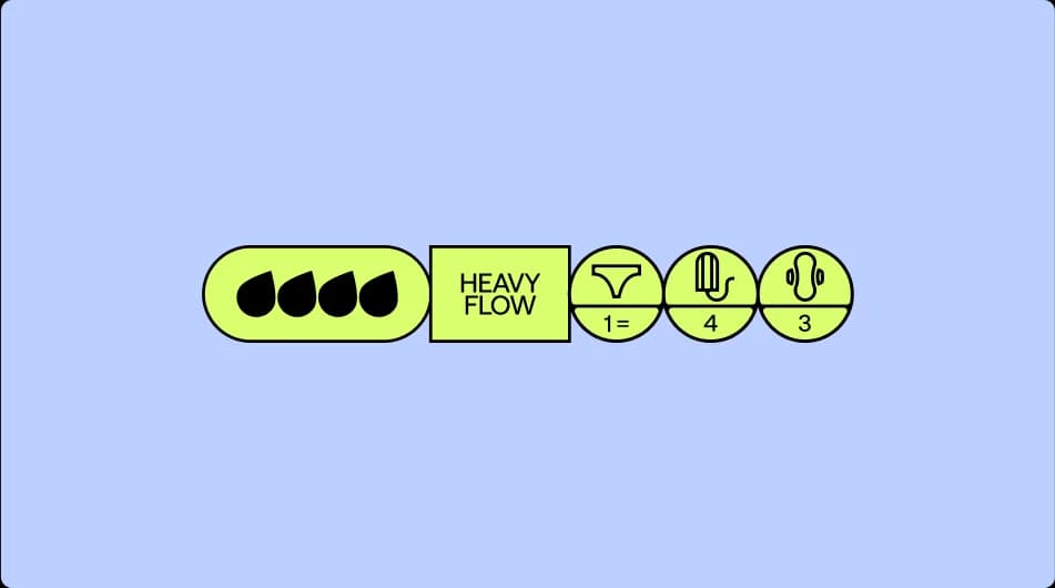
Product Categorisation
Product Taxonomy & Tonal Framework
Creative Scope
Brand Identity Systems
Art Direction & Visual Language
Verbal Identity & Platform
Motion Design & Brand Dynamics
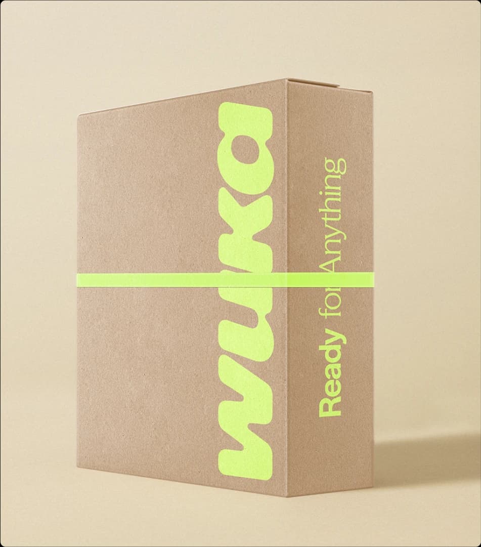
Packaging Design Systems
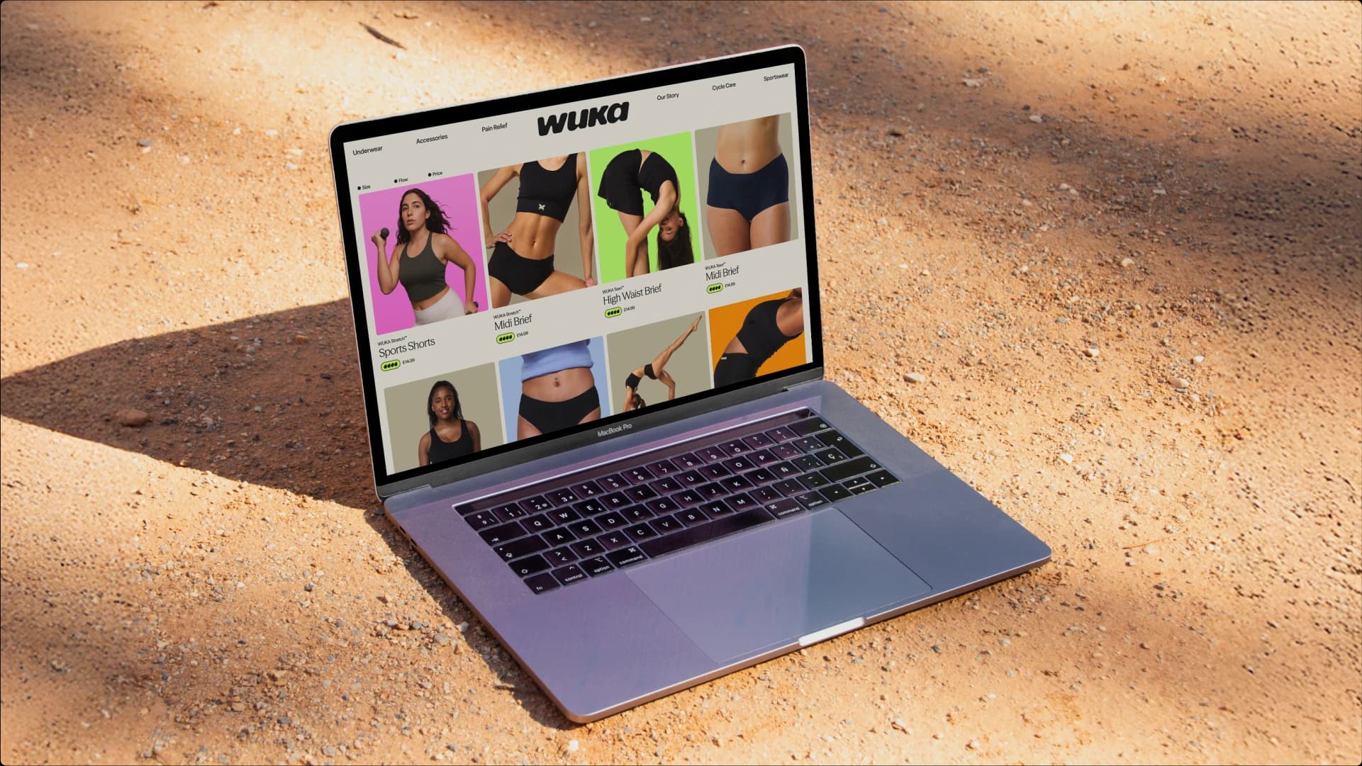
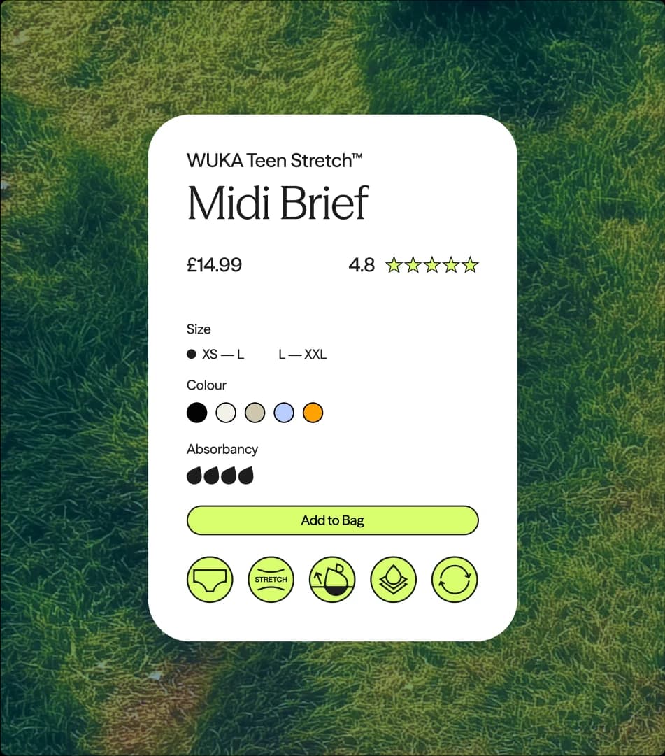
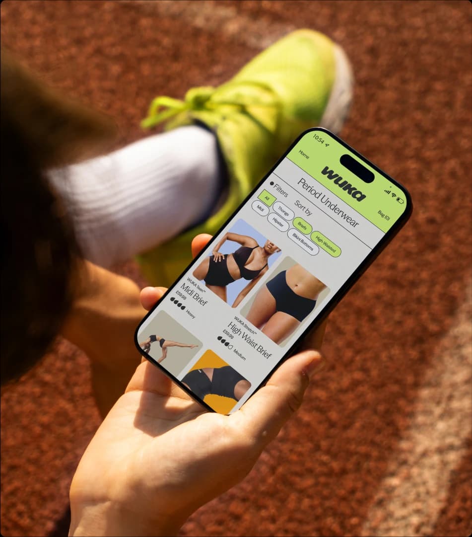
Digital Experience Design
Studio NARI team
Creative Director
Design Director
Designer
Designer
Angel Bantu
Designer
Motion
Strategy
Tone of Voice
Project Manager
Client team
CPO, CPTO, COO & Co-Founder
CEO and Co-founder
Brand Director