The Idea
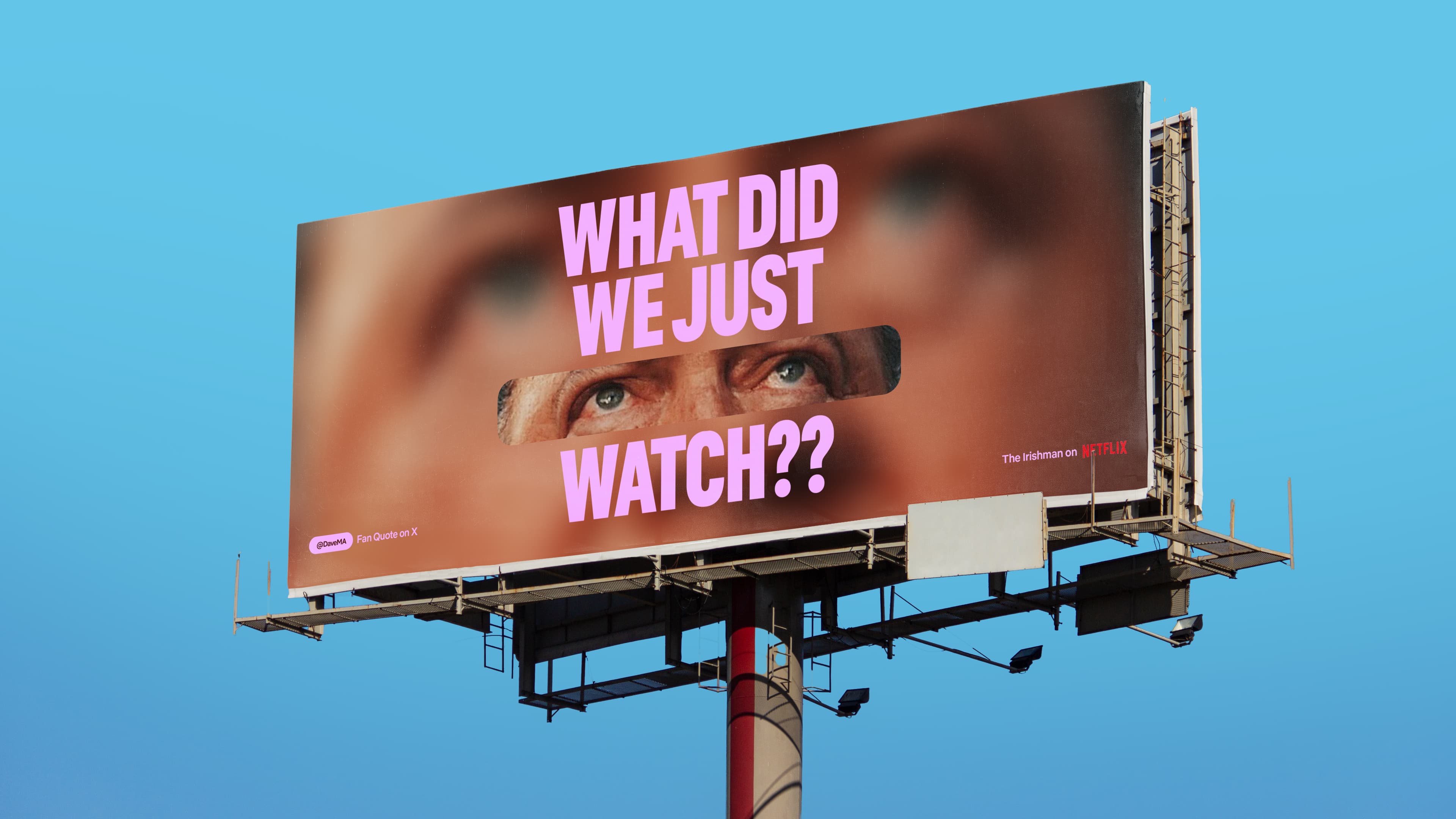
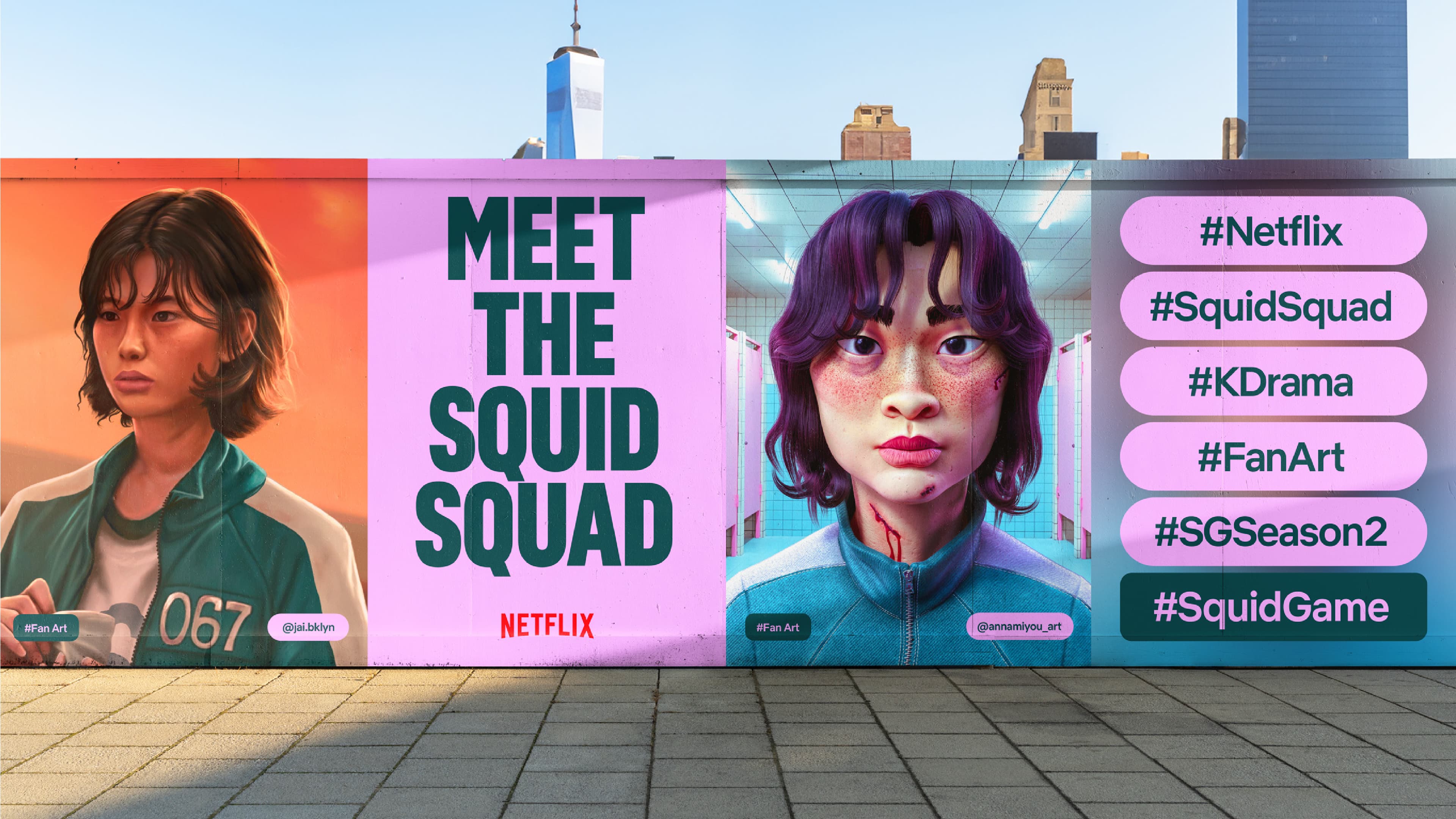
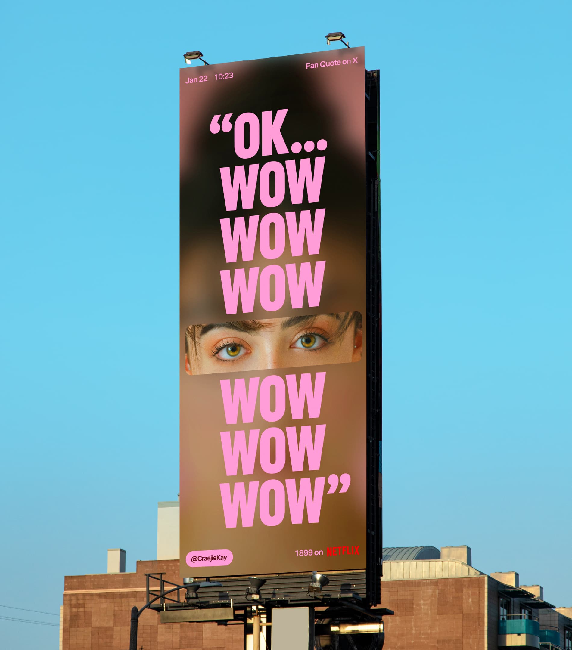
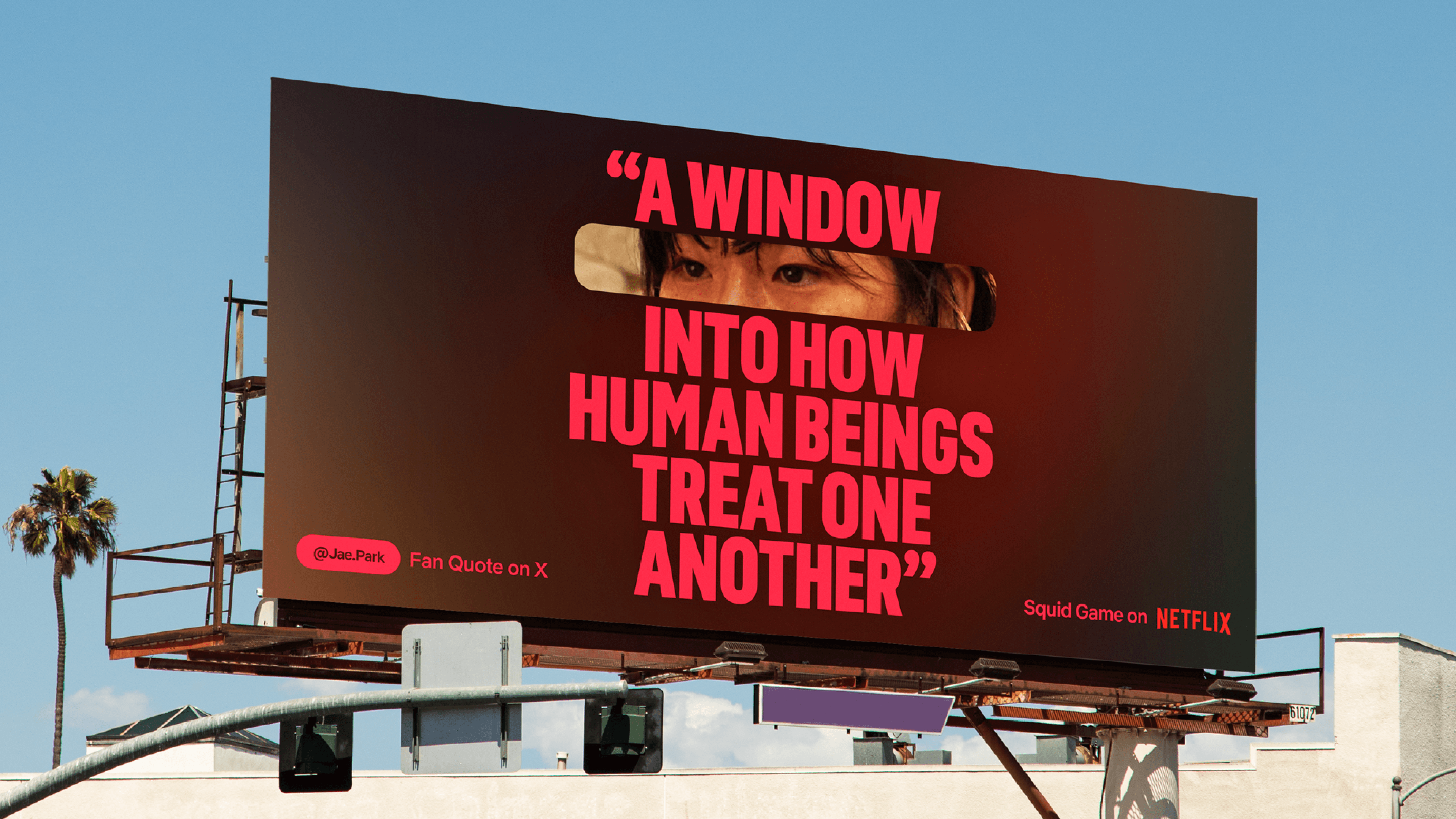
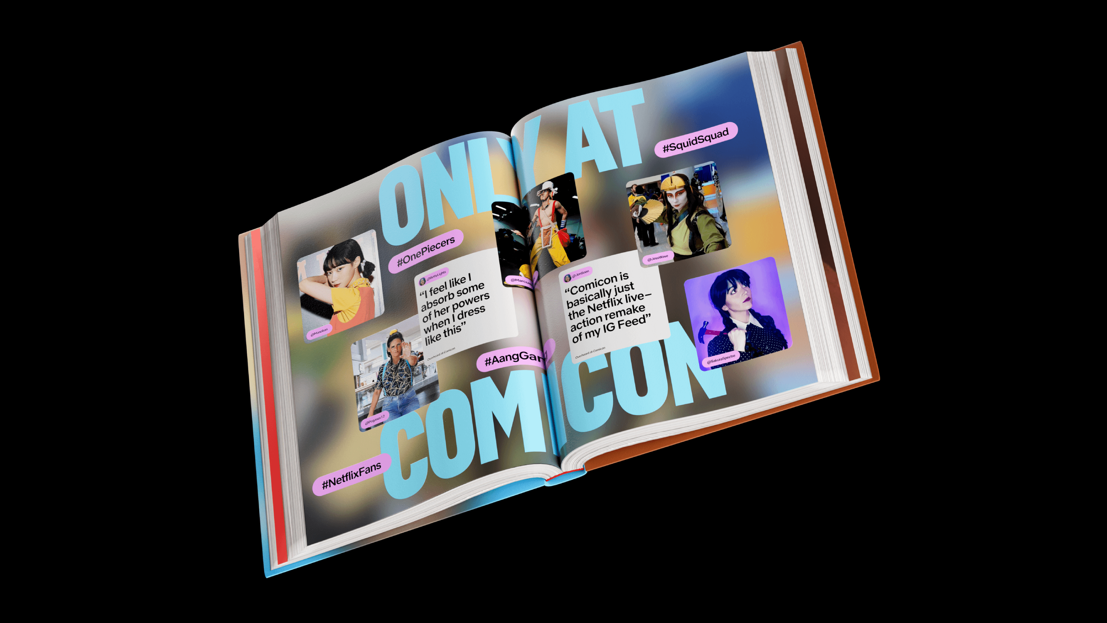
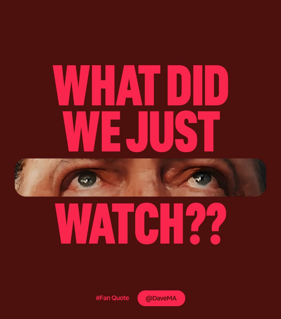
The Netflix fandom has a lot to say. We needed to create a system that puts us right into the middle of the global conversation around Netflix shows and films. By championing fan-content with a stylish, design-forward approach, we adopted an editorial feel and a tone of voice that resonates directly with user-generated content, and positioned Netflix at the core of the global dialogue surrounding its content.
The Outcome
The resulting system introduced 'windows' into the fandom, showcasing their creativity through a bold, confident, and clean motion-first approach that seamlessly integrates all types of fan content. This system is brought together by a dynamic colour palette, a multidimensional motion system, and a tone crafted to pique curiosity and drive FOMO, all working together to retain Netflix’s positioning as the go-to spot for viewer excitement.
The Scope
Marketing Toolkit Identity, Campaign, Motion System

Studio NARI team
Caterina Bianchinni
Creative Director
Design Lead
Motion Design
Design
Design
Felipe Mollica
Netflix Team
Spencer Somers
Netflix Team
Lucia Riquelme
Netflix Team
