Every screen, every surface, every market. One system.
Context
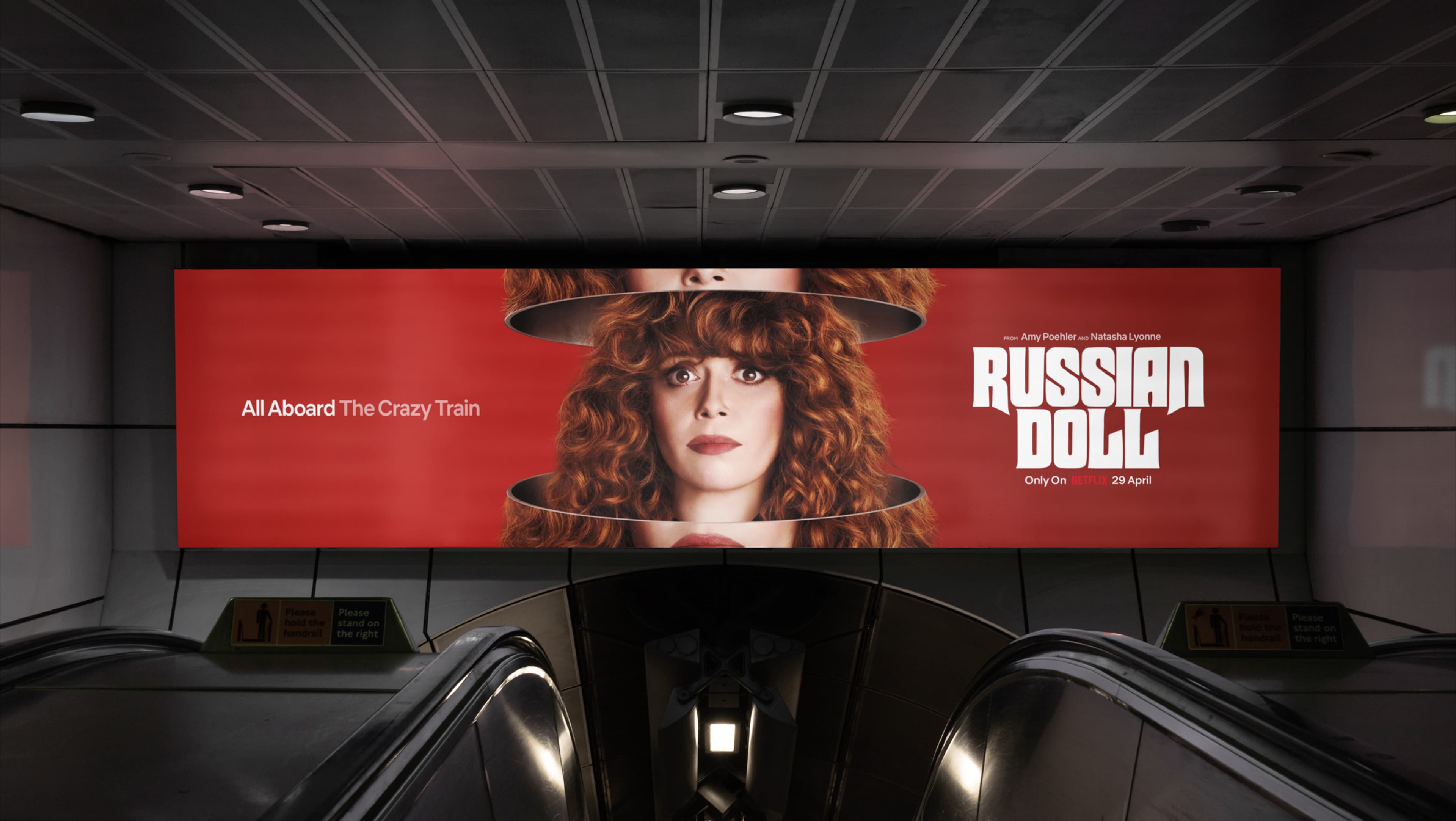
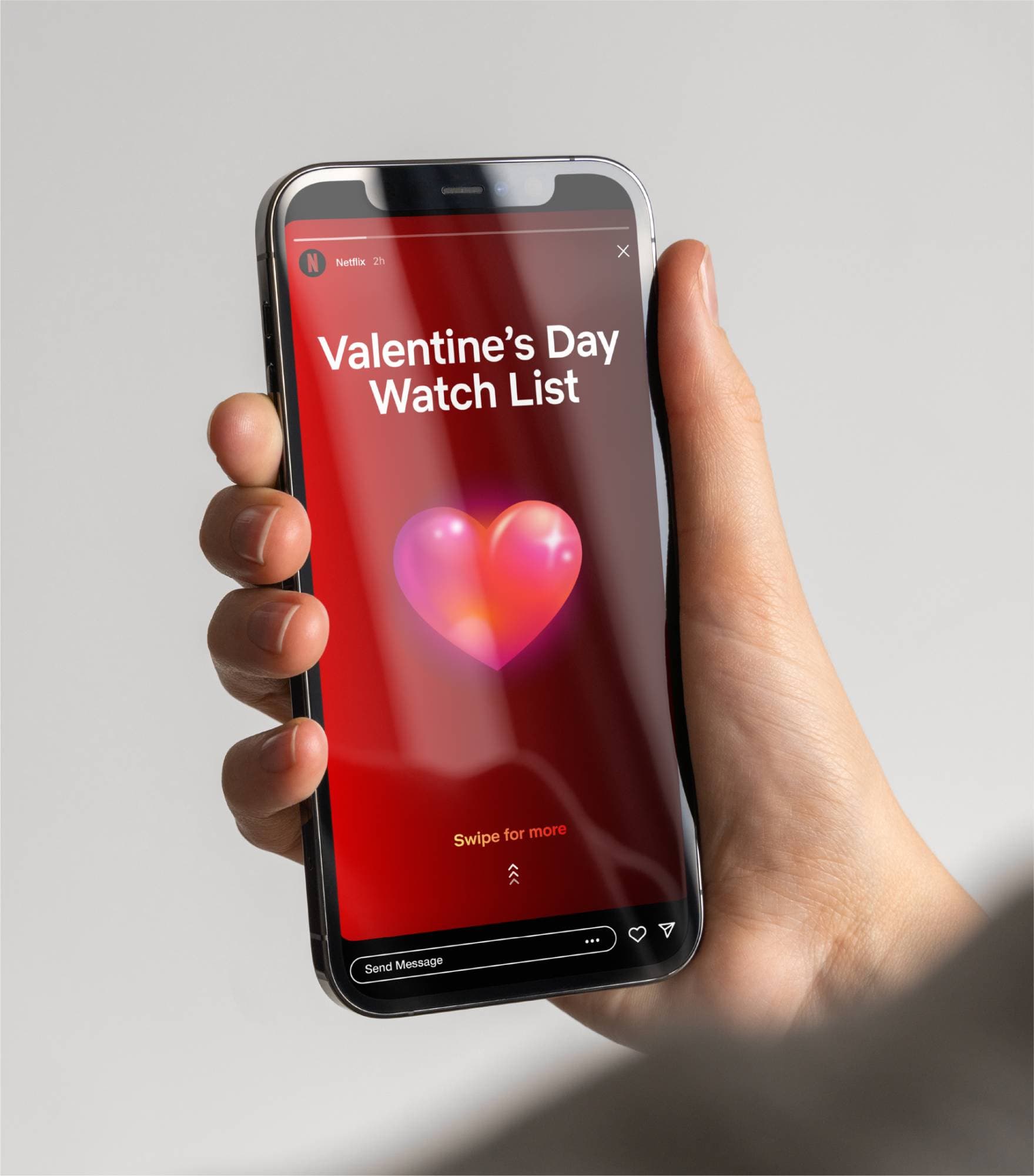
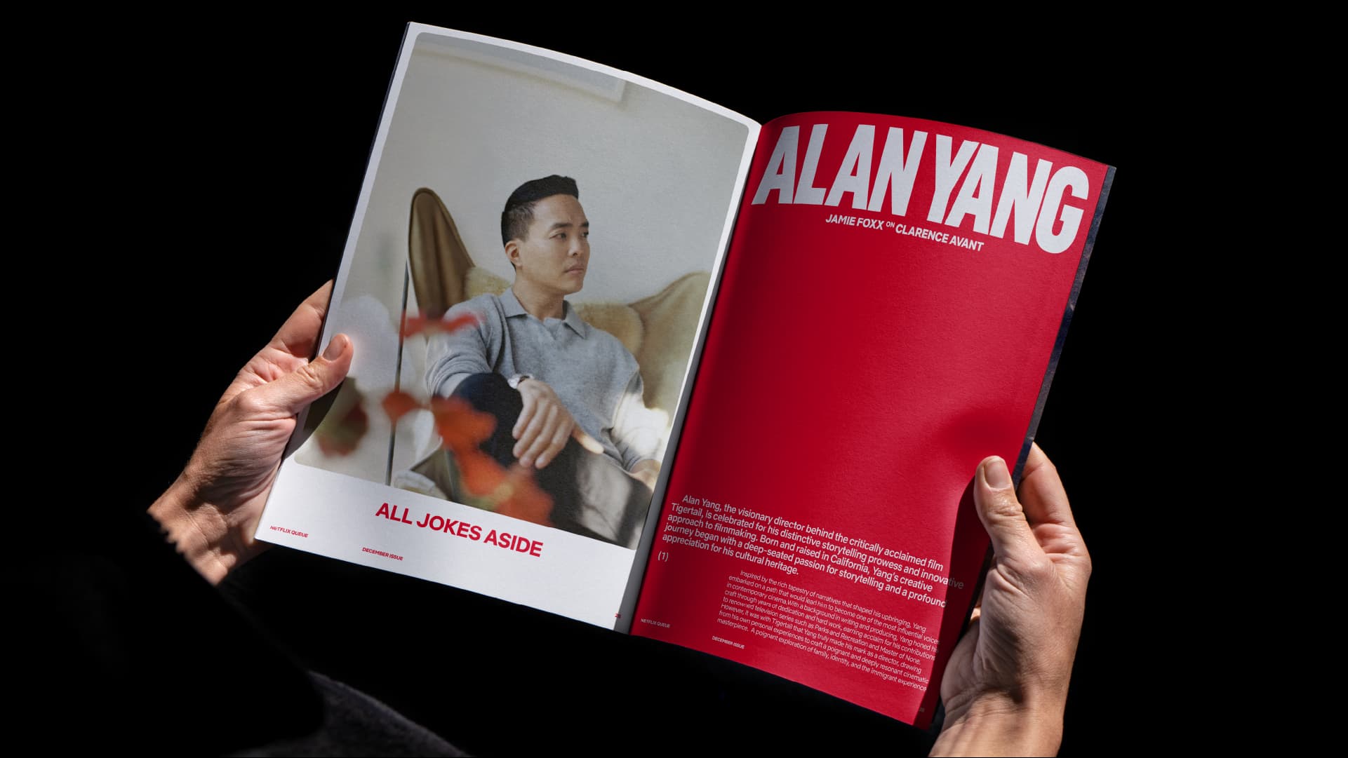
Netflix is no longer just a streaming platform. It now operates across gaming, live events, physical experiences, an ad-supported tier and merchandise. The brand's core visual elements were built for screens and had begun fragmenting as dozens of internal teams and external partners interpreted them differently across new contexts. What was commercially at stake was not recognition but coherence: the gap between how Netflix looked on a phone and how it appeared on a billboard, a building or a corporate deck was widening with every new business line.
Unlock
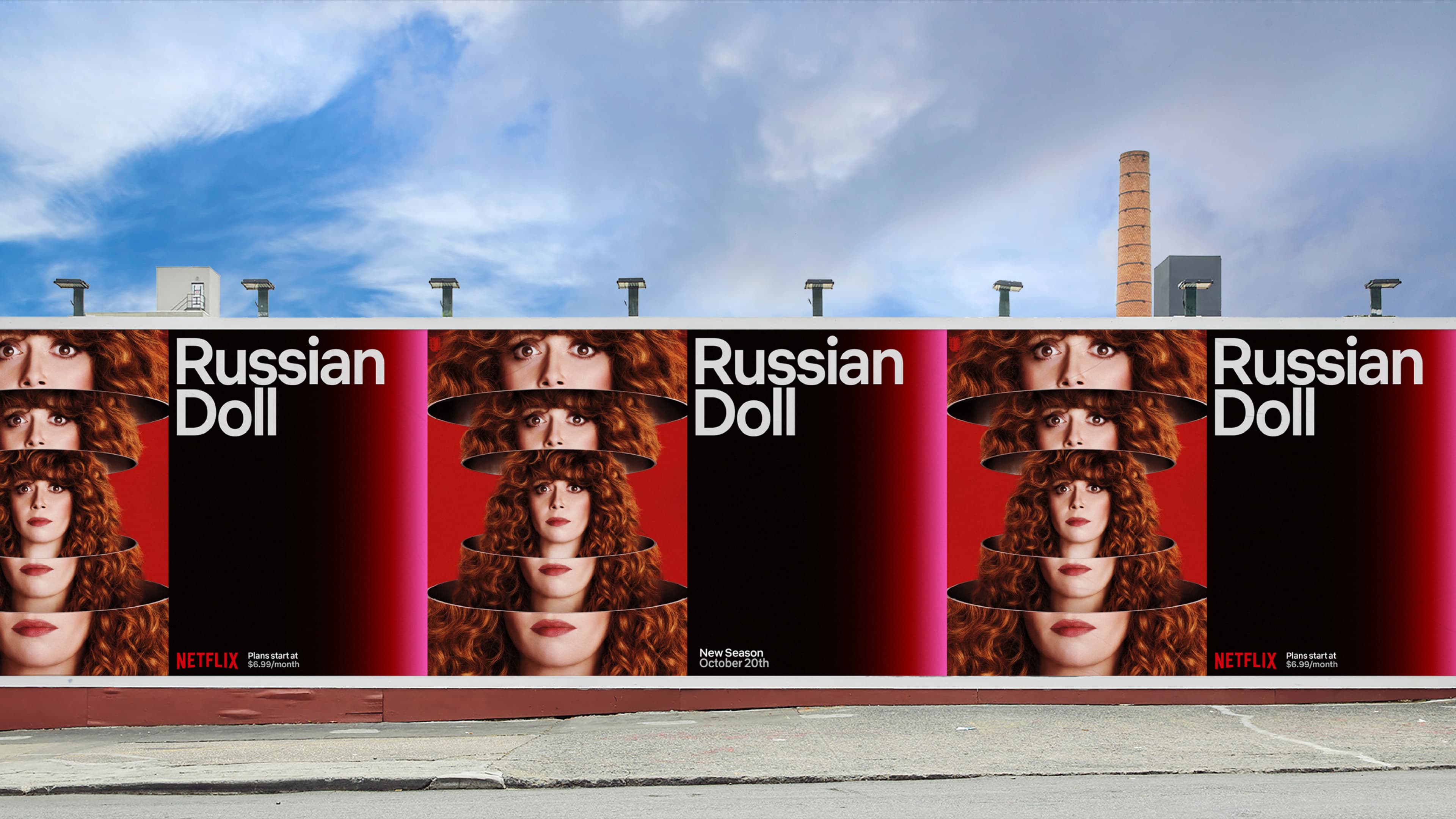
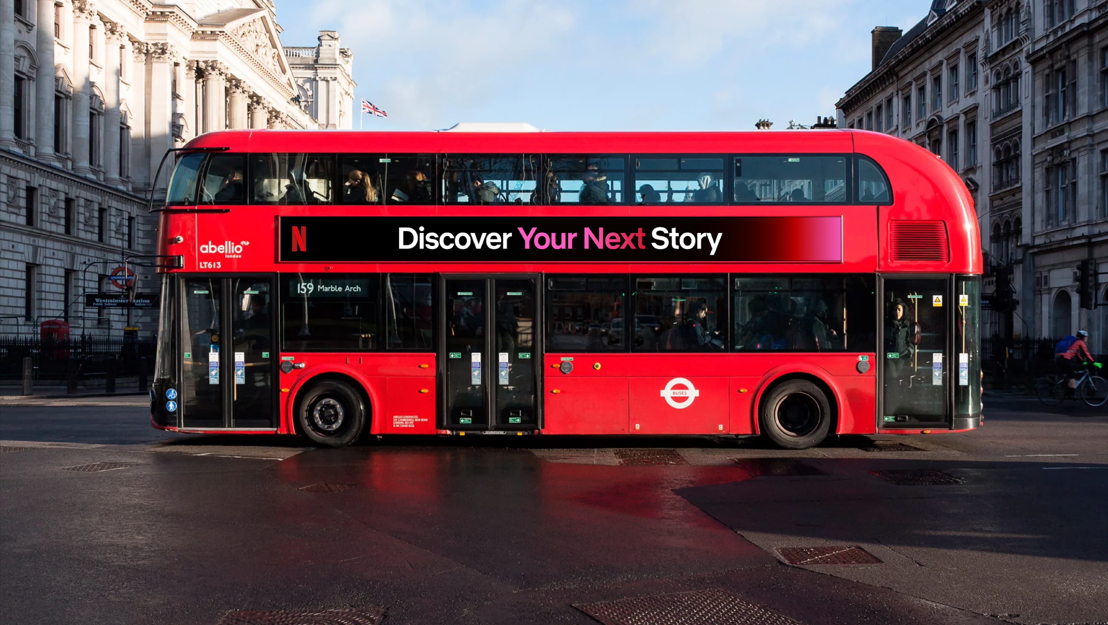
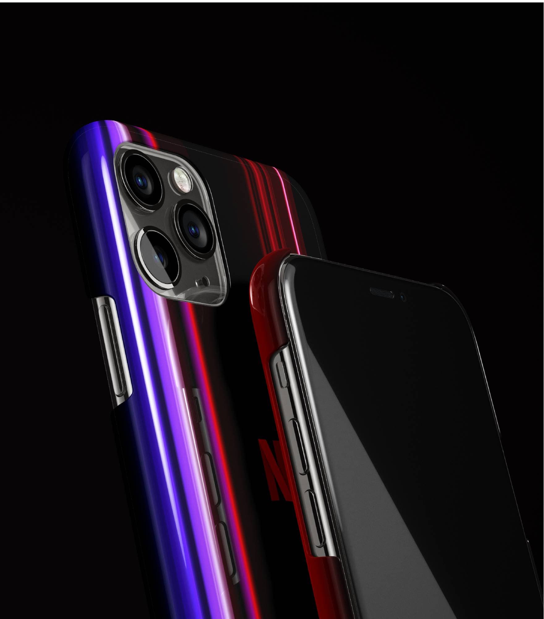
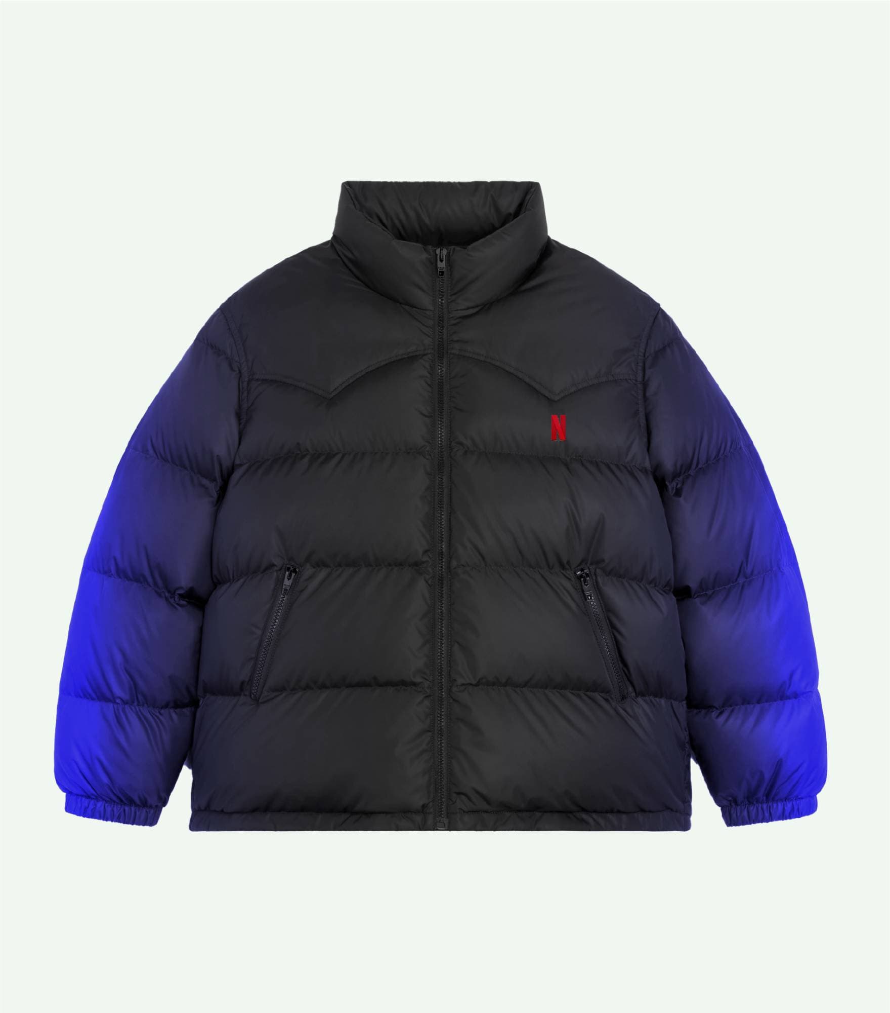
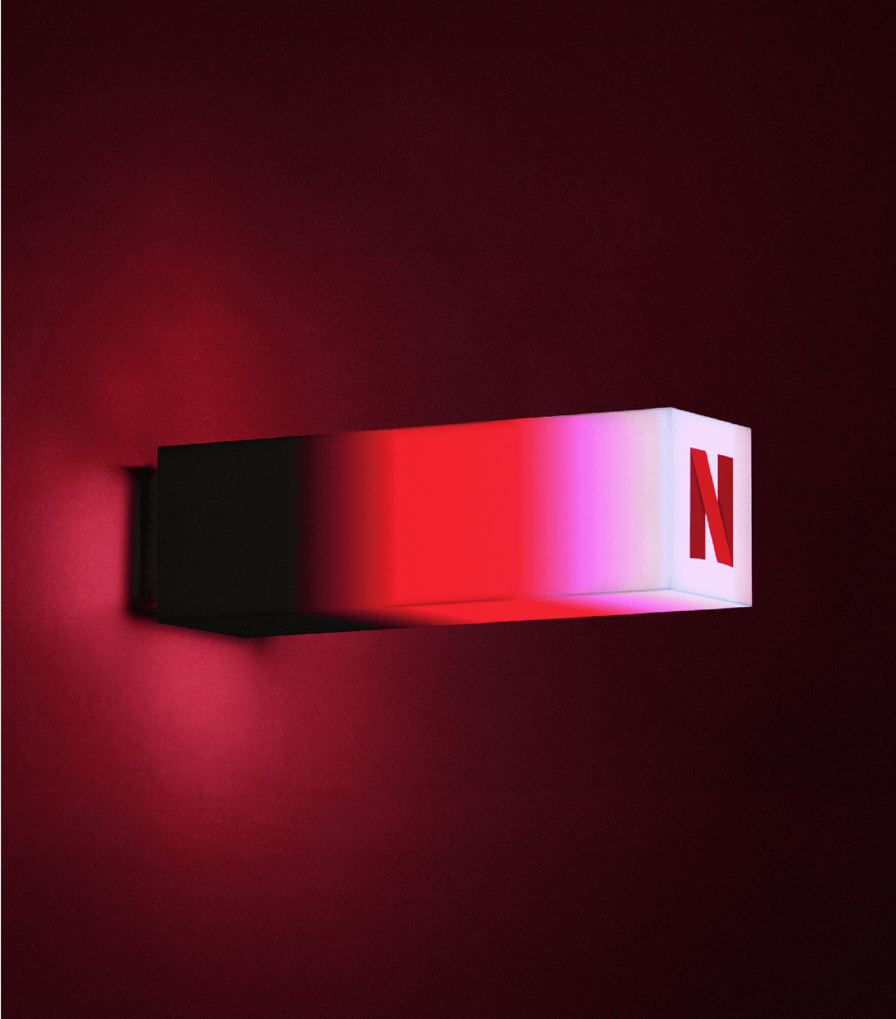
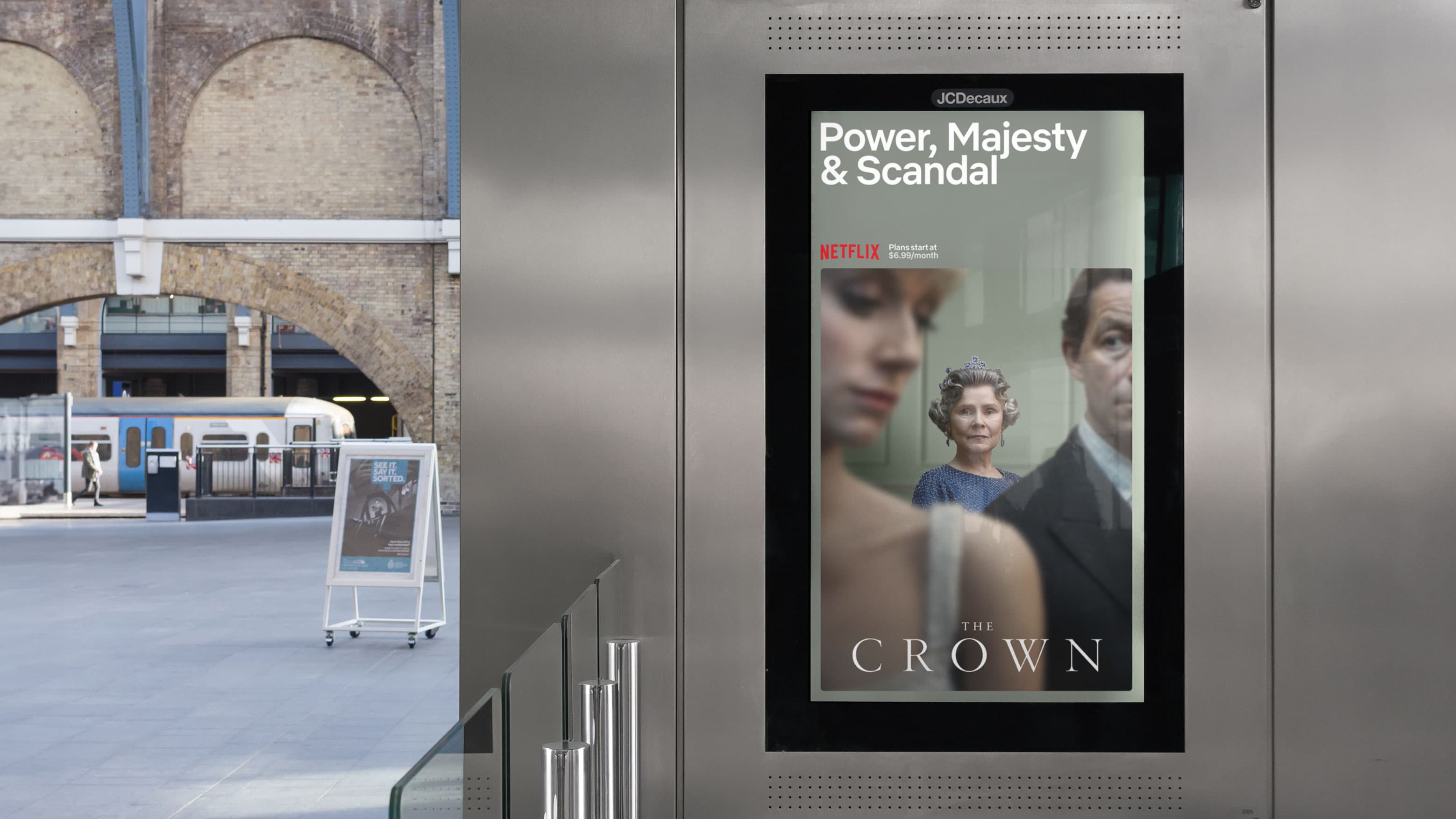
Netflix's visual identity had been communicating one product. The business now delivers a feeling: the thrill of what's next. The streams evolved from a single uniform element into a plural, multi-coloured system that carries the energy and range of Netflix's expanding universe. The typographic framework was rebuilt for universal adoption across the entire company, on and off screen. Both changes translate the same principle: a brand defined by anticipation should never look like it has only one thing to show you.

Create
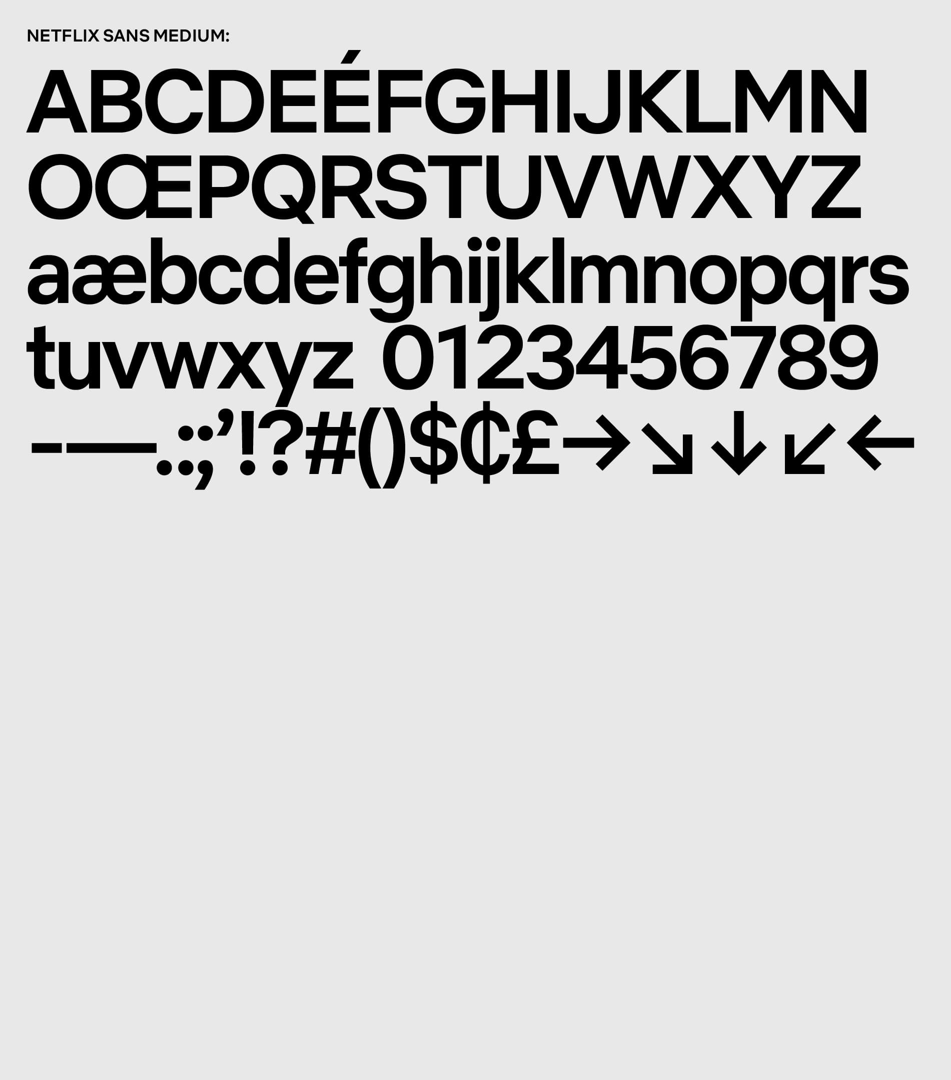
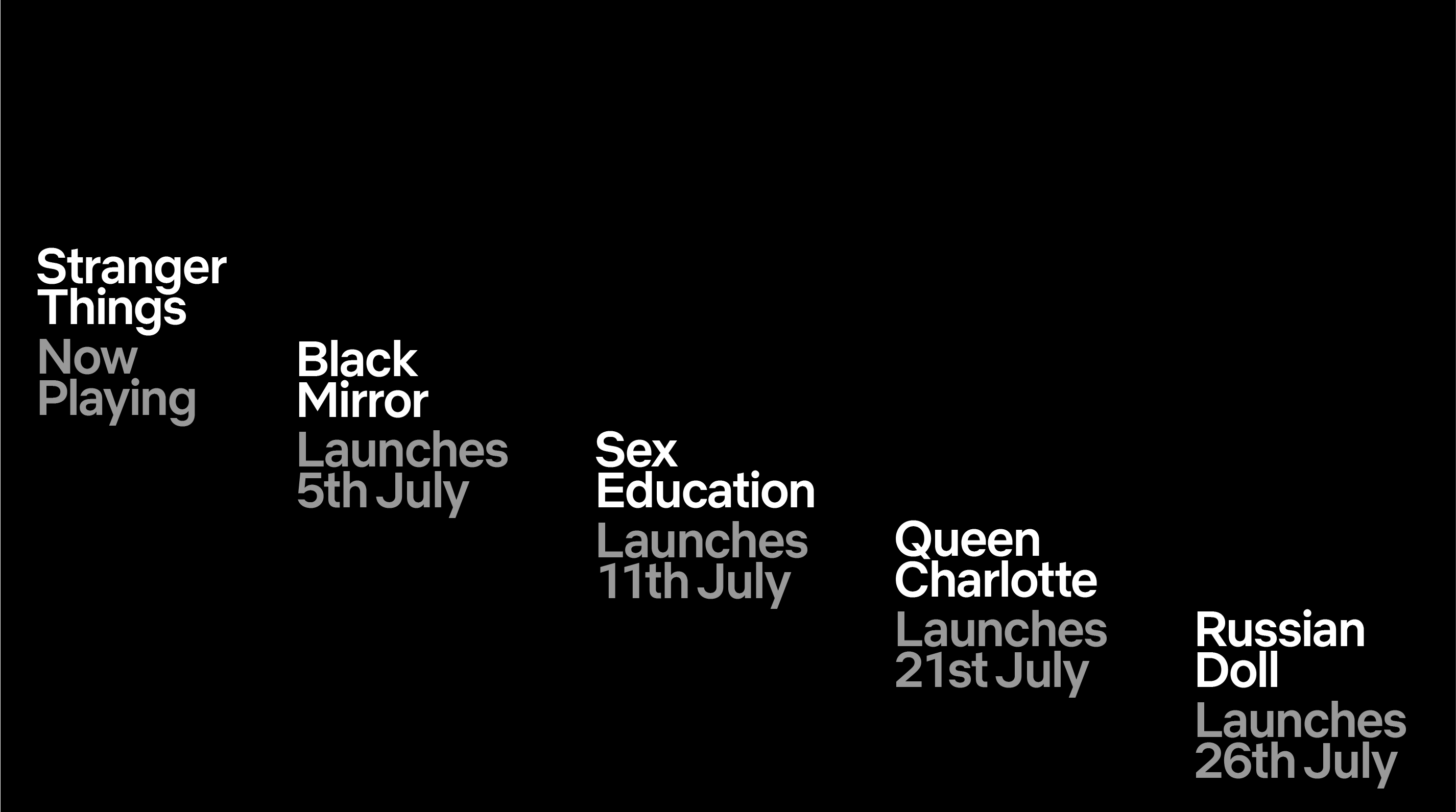
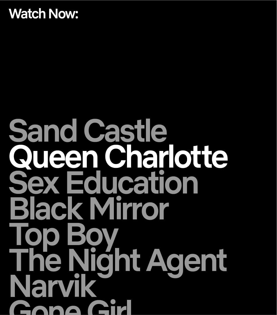
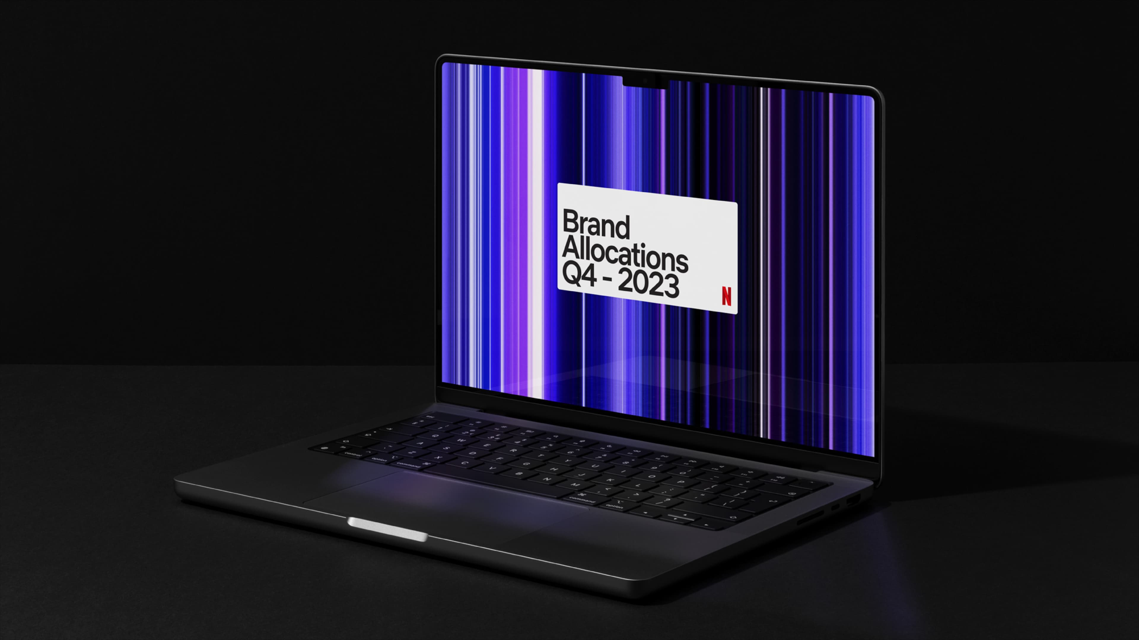
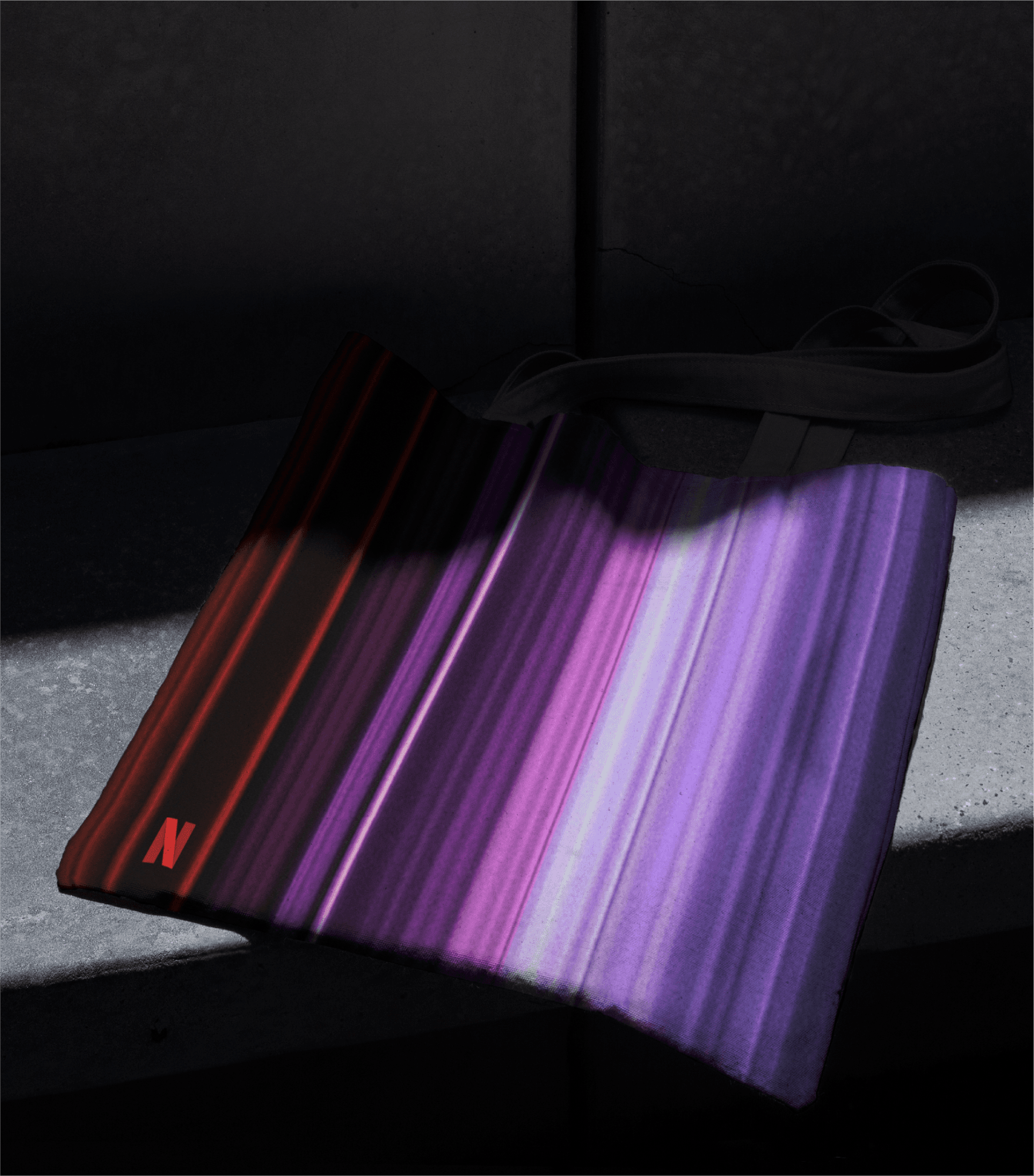
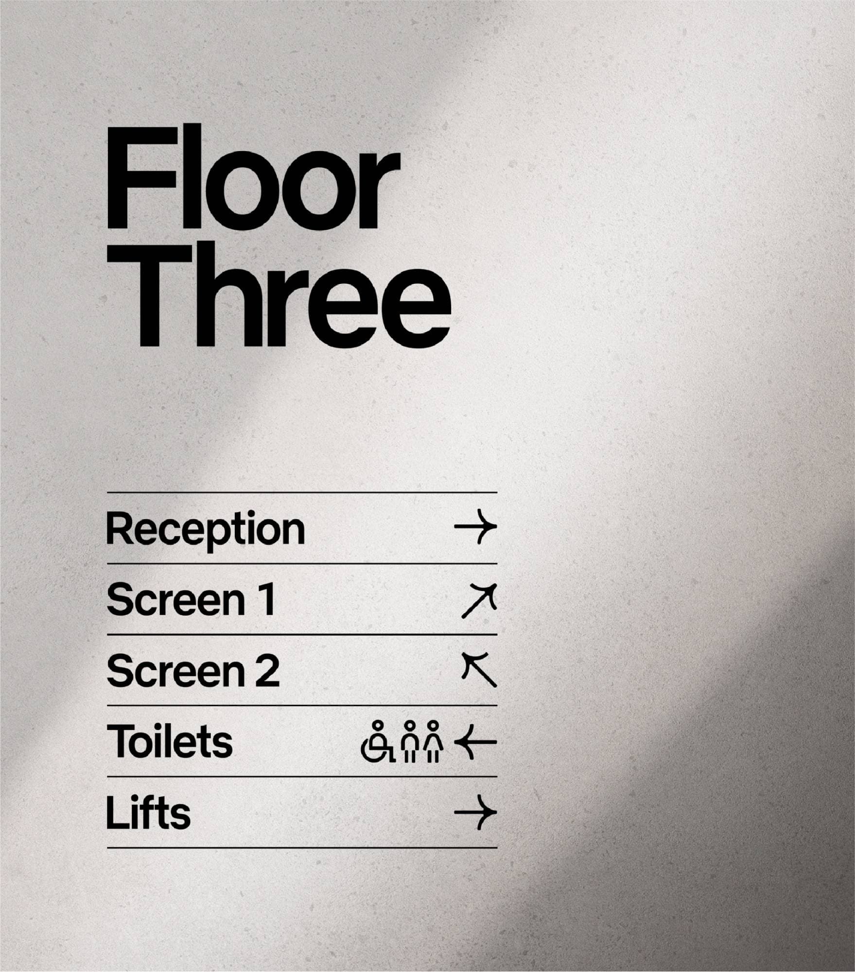
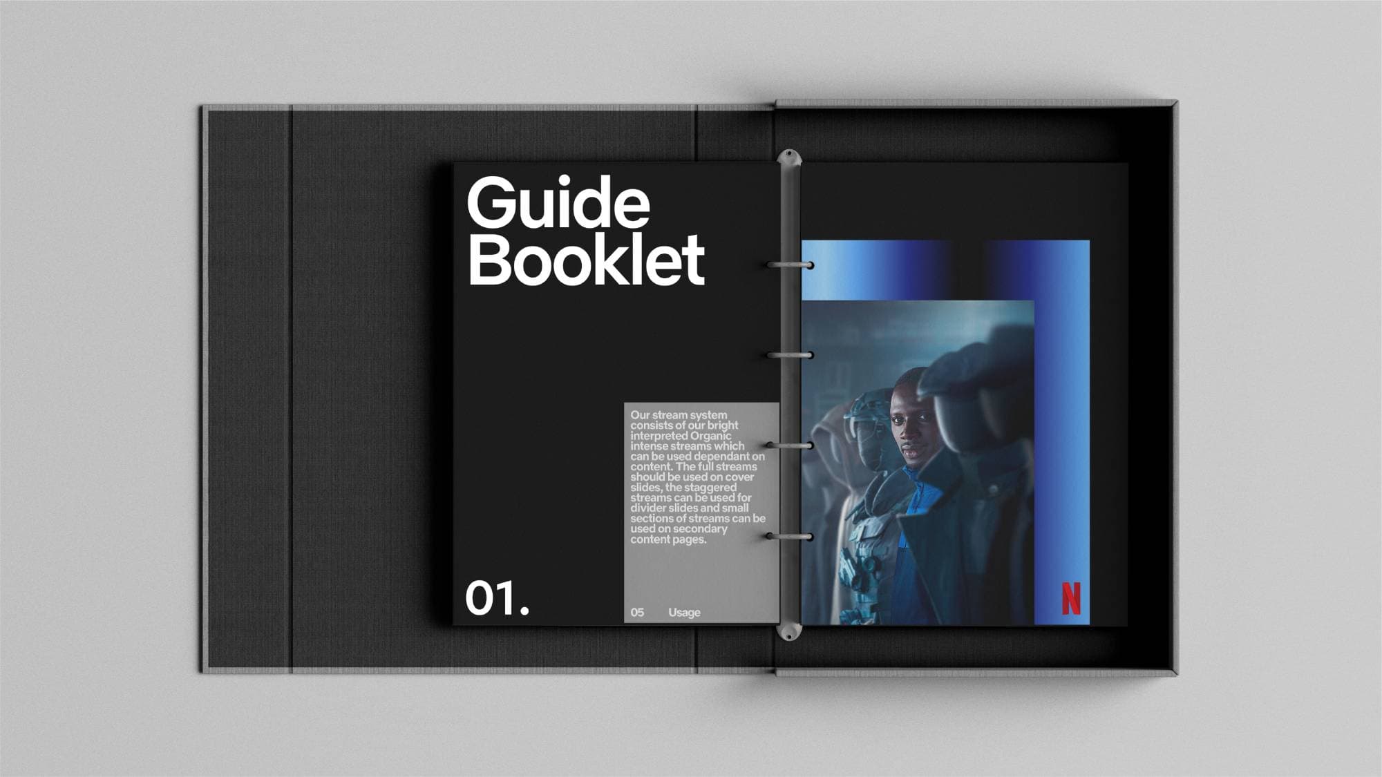
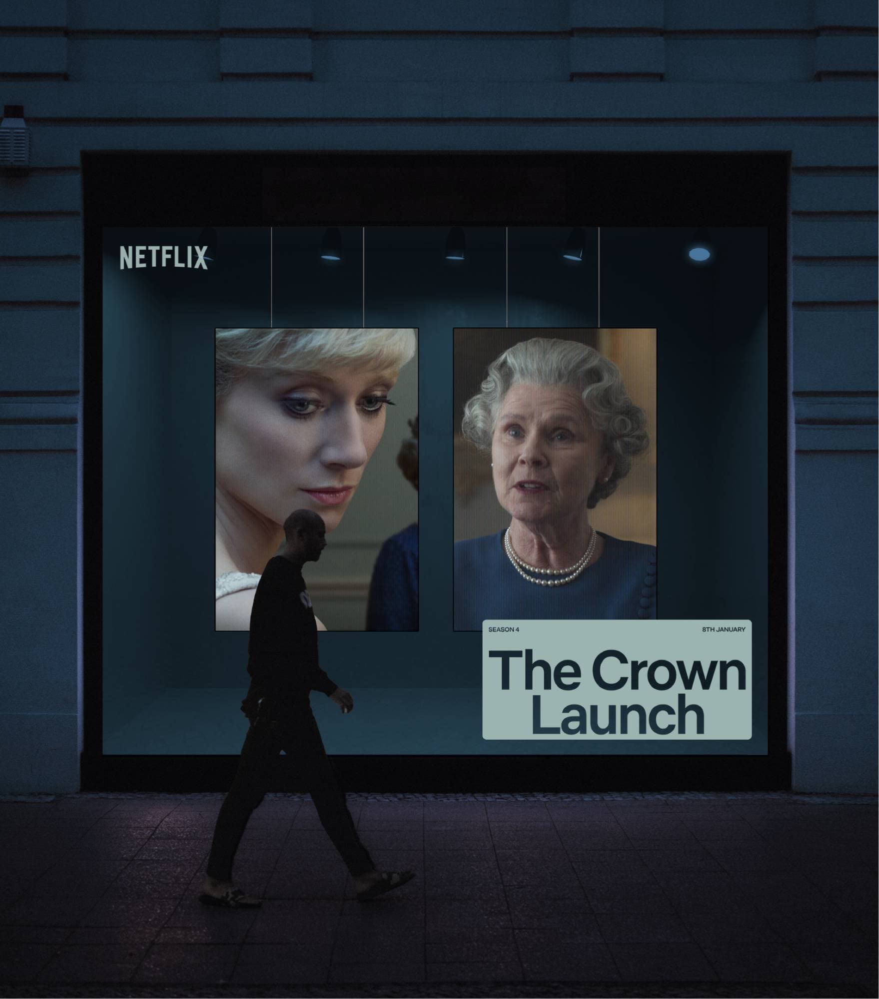
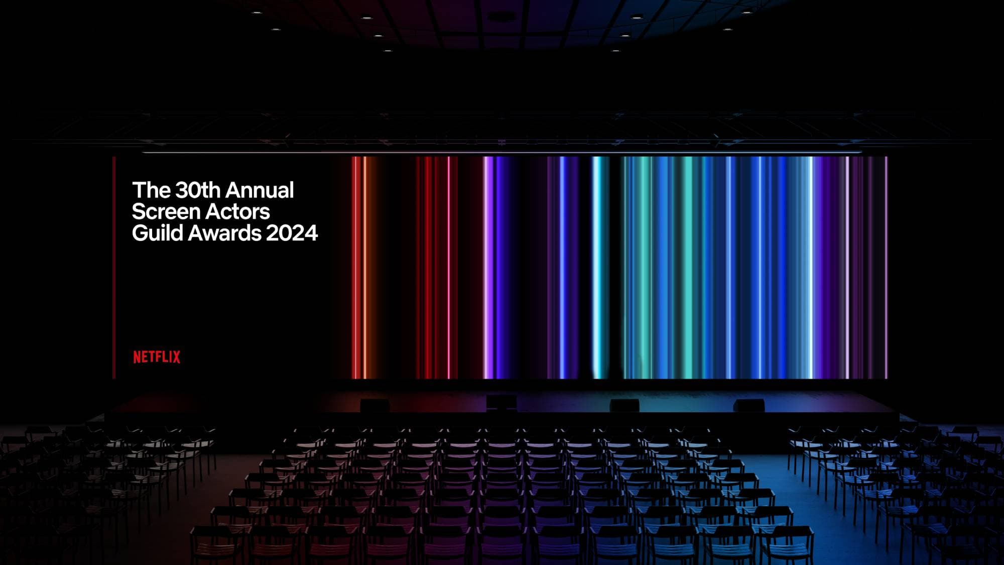
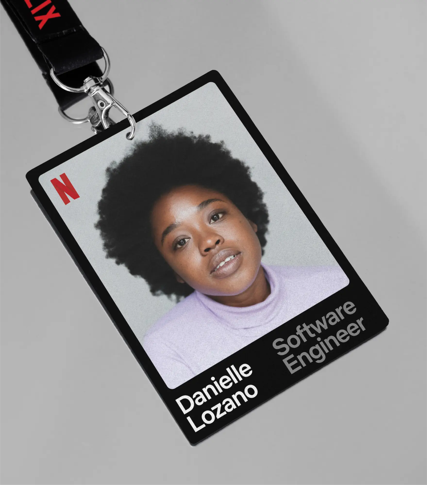
The original stream was singular, red and directional. Multiple streams in diverse colours replace constraint with plurality, signalling range without abandoning the signature element. The alternative was refinement within the existing single-stream approach, which would have reinforced a one-platform, one-experience identity Netflix had already outgrown. The typographic framework codifies how Netflix Sans operates across every weight and context, from mobile UI to stadium signage to corporate communications. Tighter rules reduce individual interpretation but eliminate the fragmentation that was diluting the brand across 190 markets.

Become
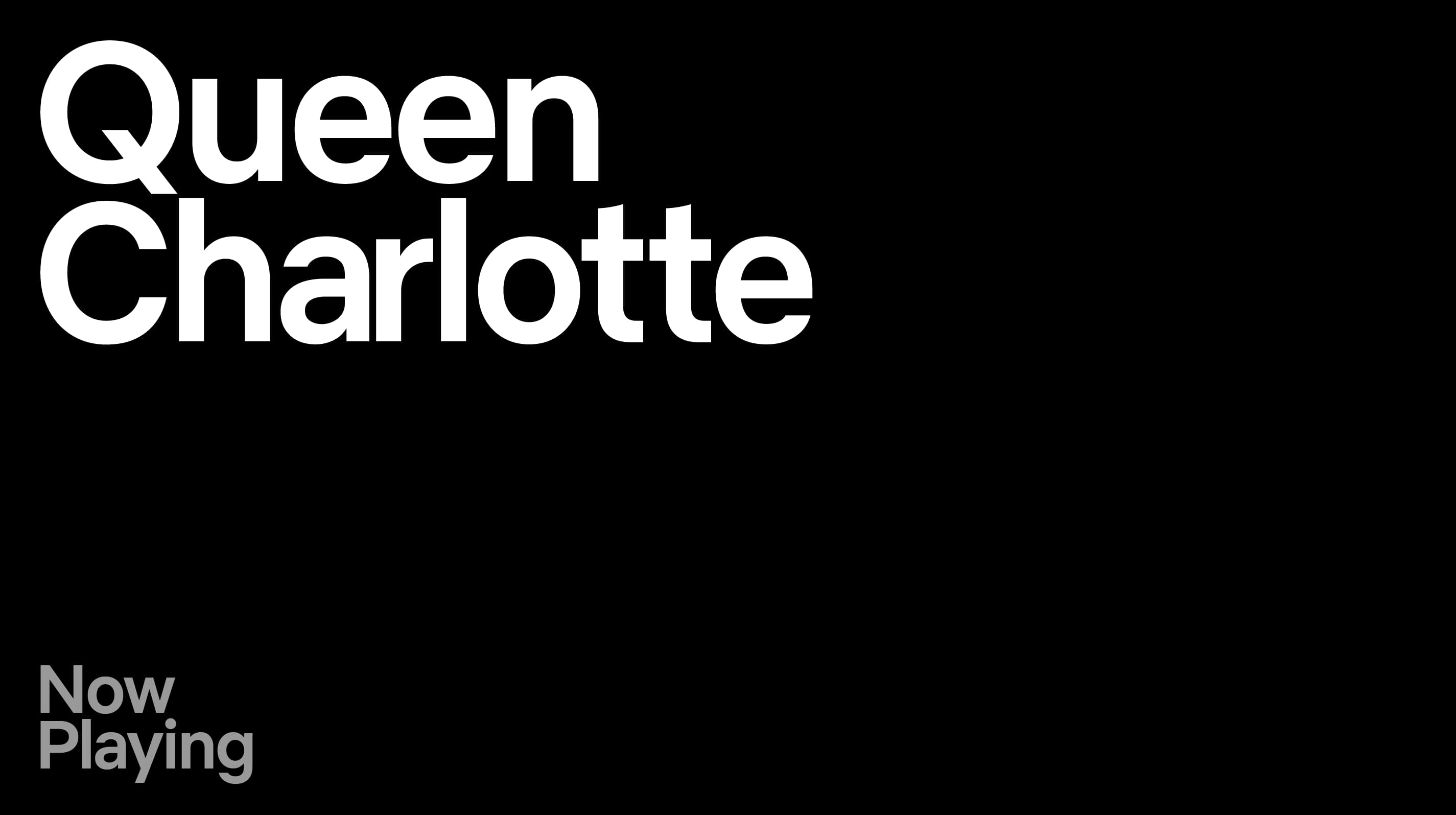
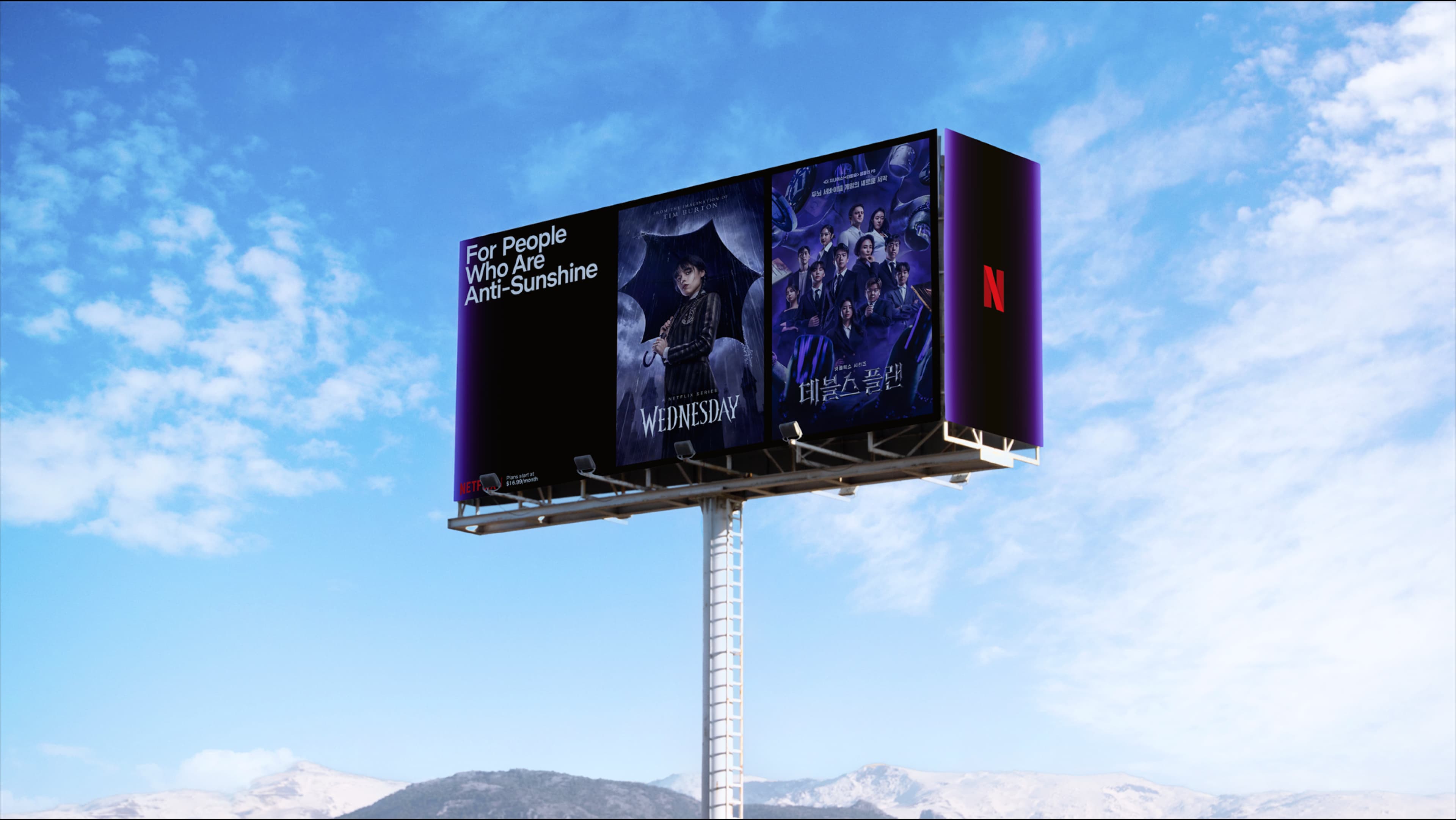
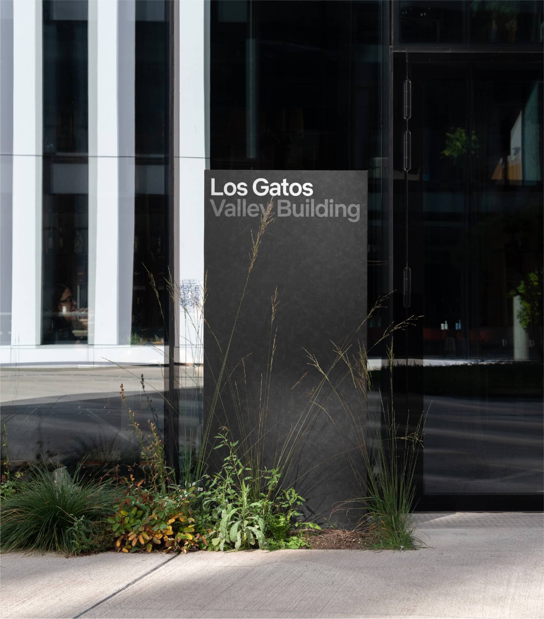
The system governs how Netflix appears on a phone screen, a billboard, a Netflix House entrance, a corporate presentation and a piece of merchandise. Internal teams and external partners worldwide work from the same framework, removing the need for case-by-case art direction. The streams flex in colour, number and composition depending on context while the typographic rules stay fixed. Consistency no longer depends on who is making the work or where it appears.
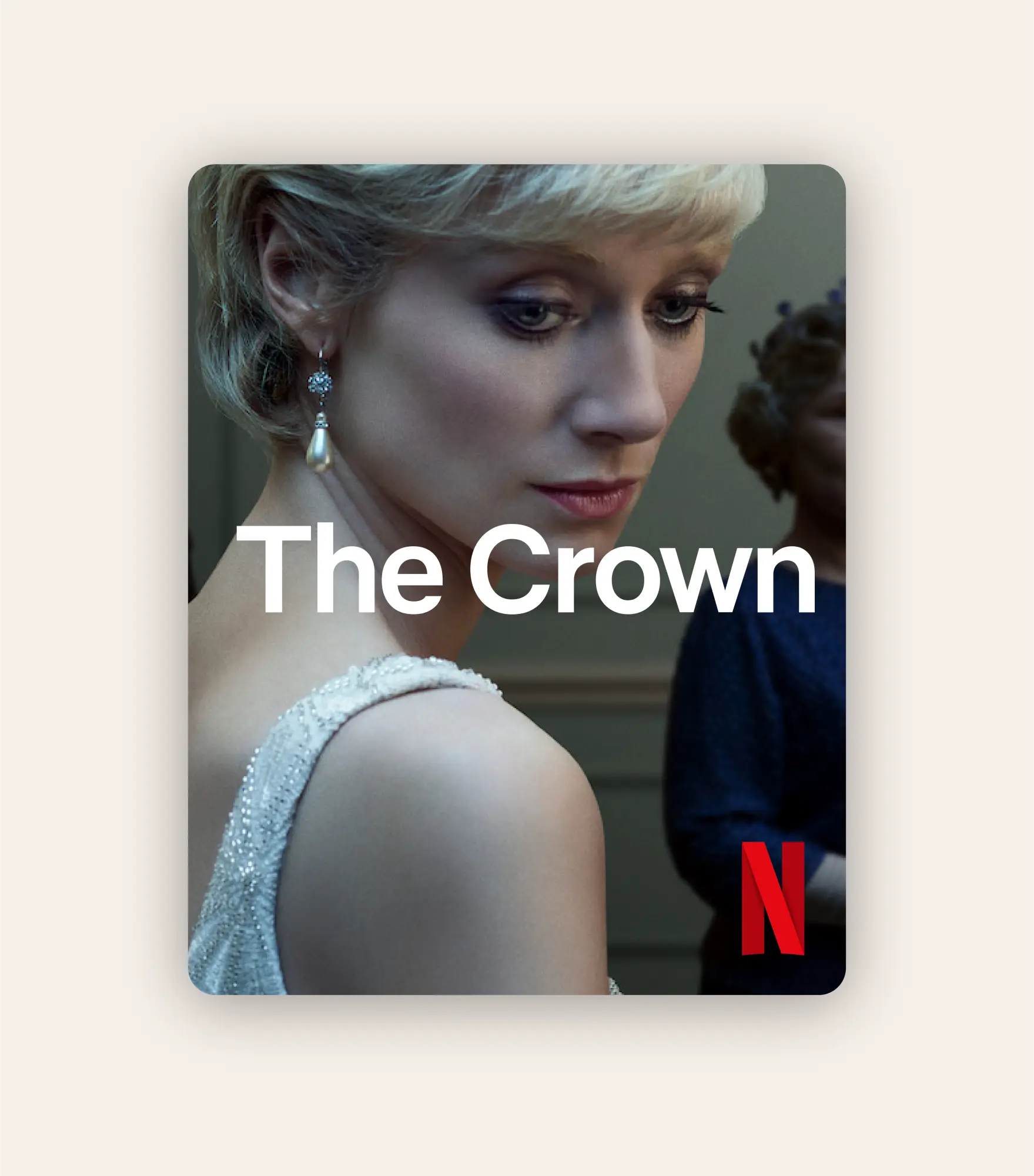
Unmistakably Netflix
Netflix's core brand elements now function as a single system across every surface the business touches. The refresh closed the gap between a streaming identity and an entertainment company operating in physical space, live events, advertising and retail without requiring a full rebrand. A brand built on anticipation now looks the part everywhere it shows up. Sales of visual coherence are harder to measure than sales of product, but the commercial consequence is structural: Netflix can enter any new format or market and arrive looking like itself.
Strategic Scope
Brand Positioning
Brand Architecture
Brand Strategy
Creative Scope
Creative Direction
Visual Identity
Typography
Motion
Studio NARI team
Creative Director
Design Lead
Designers
Designers
Designers
Typographer
Motion Design
Motion Design
Motion Design
Noah Nathan
Netflix Team
Felipe Mollica
Netflix Team
Ange Iannarelli
Netflix Team
Juan Munoz
Netflix Team
Project Manager