An Identity for Connsesiurs of Creative Culture
Context
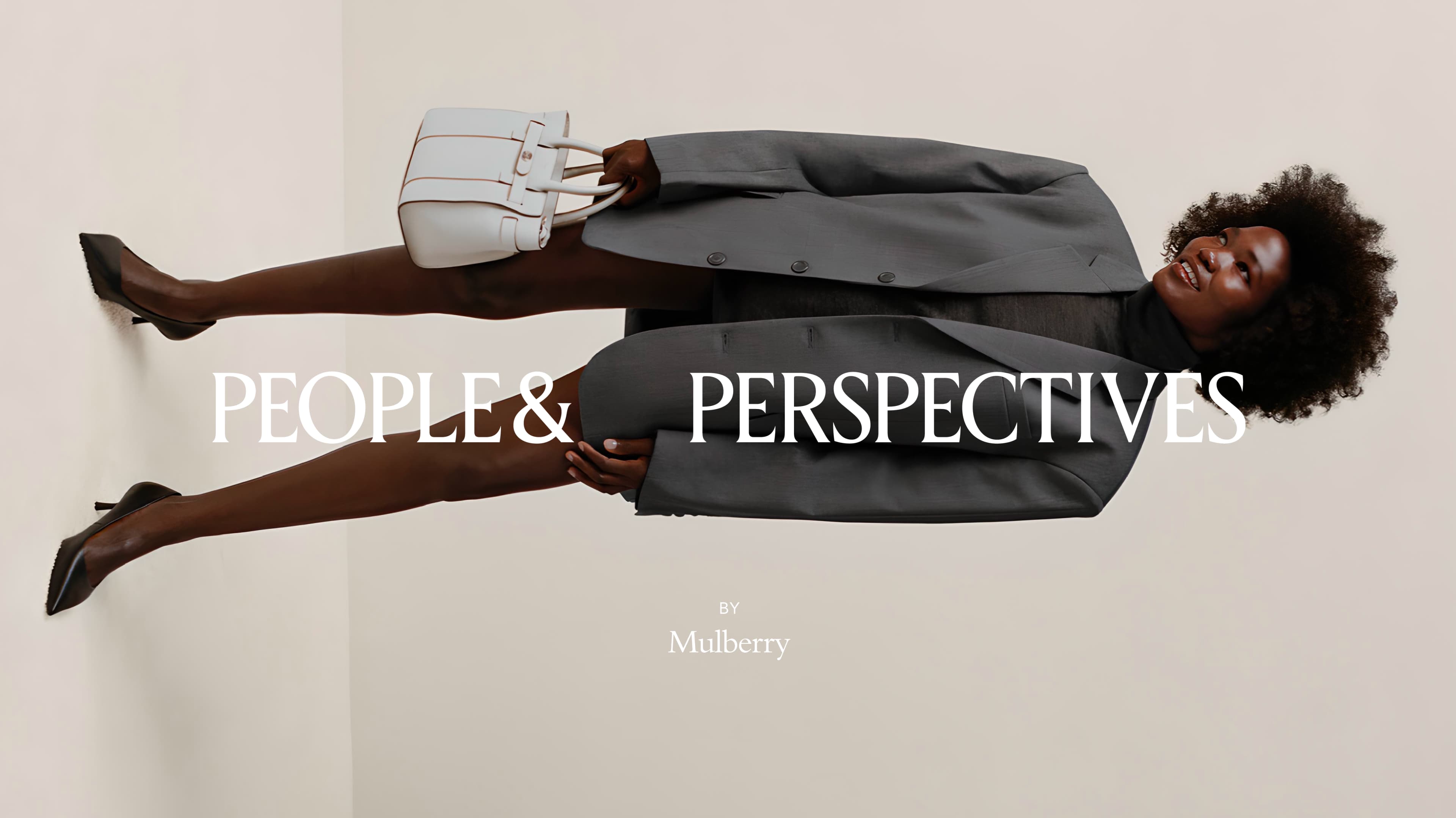
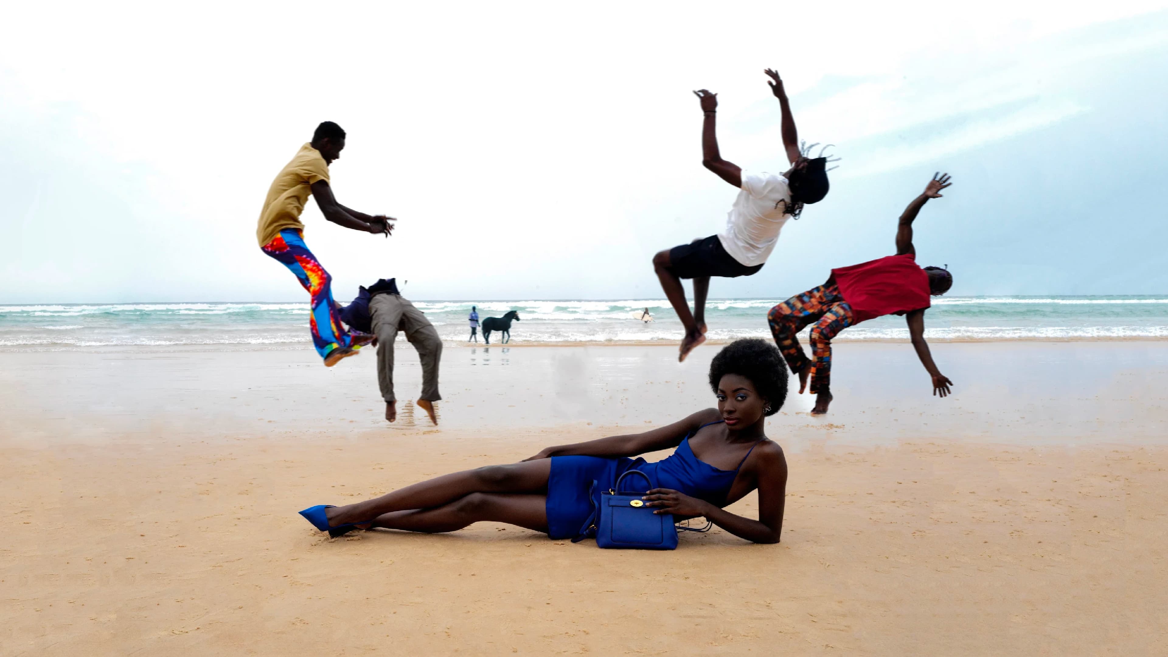
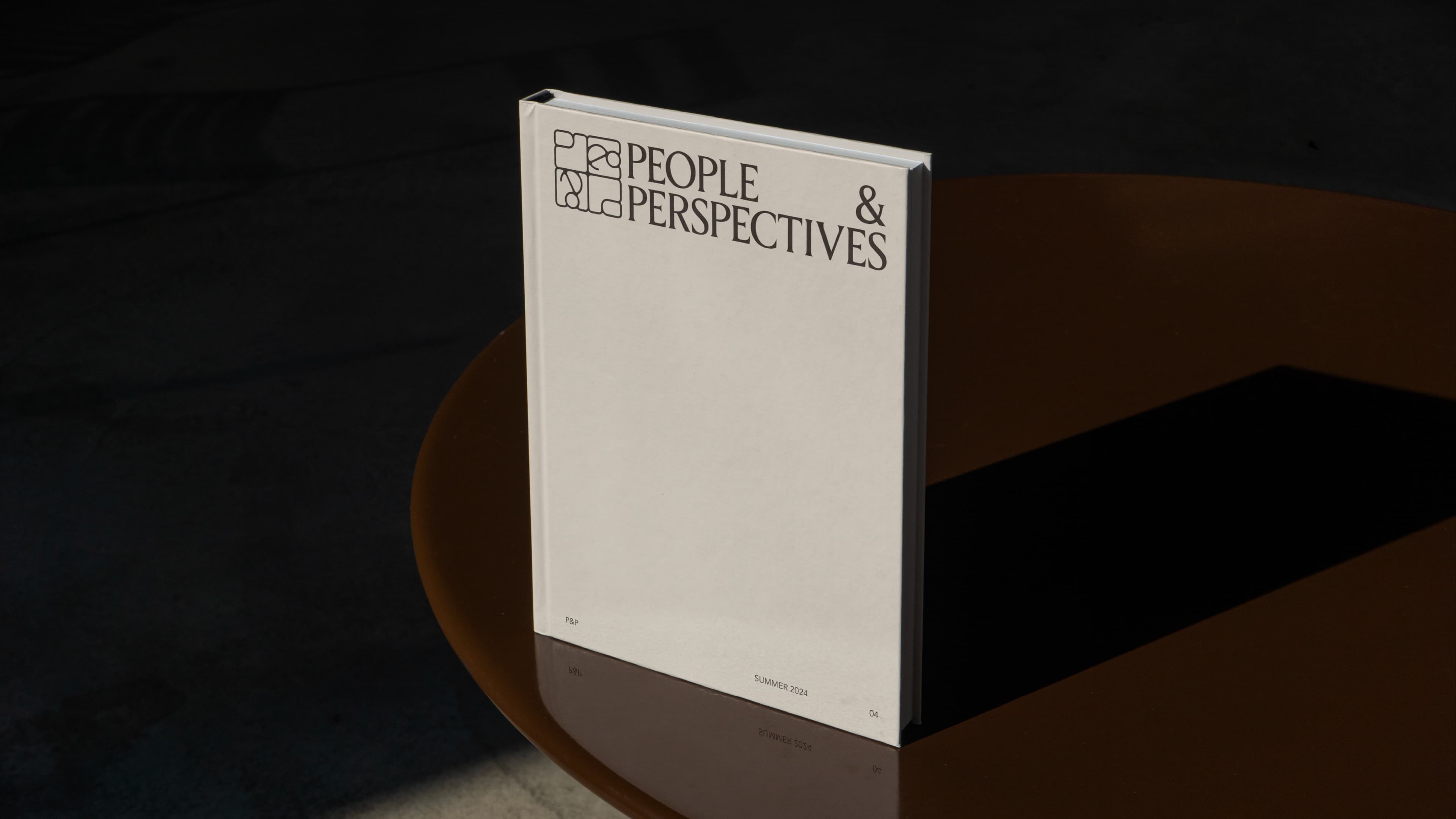
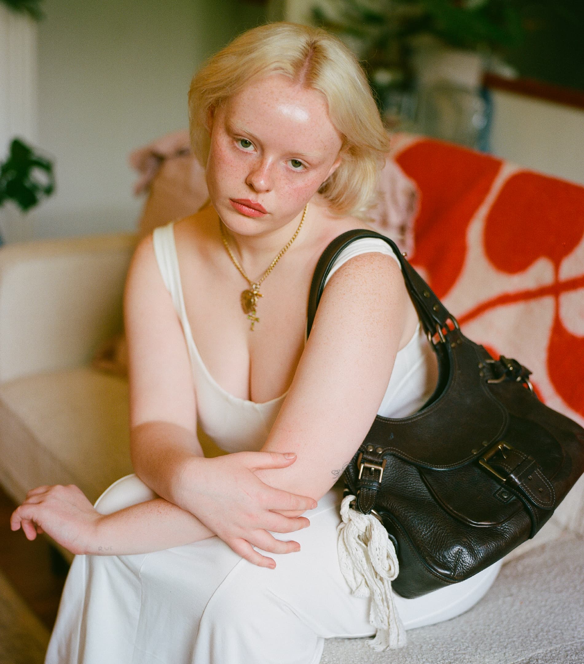
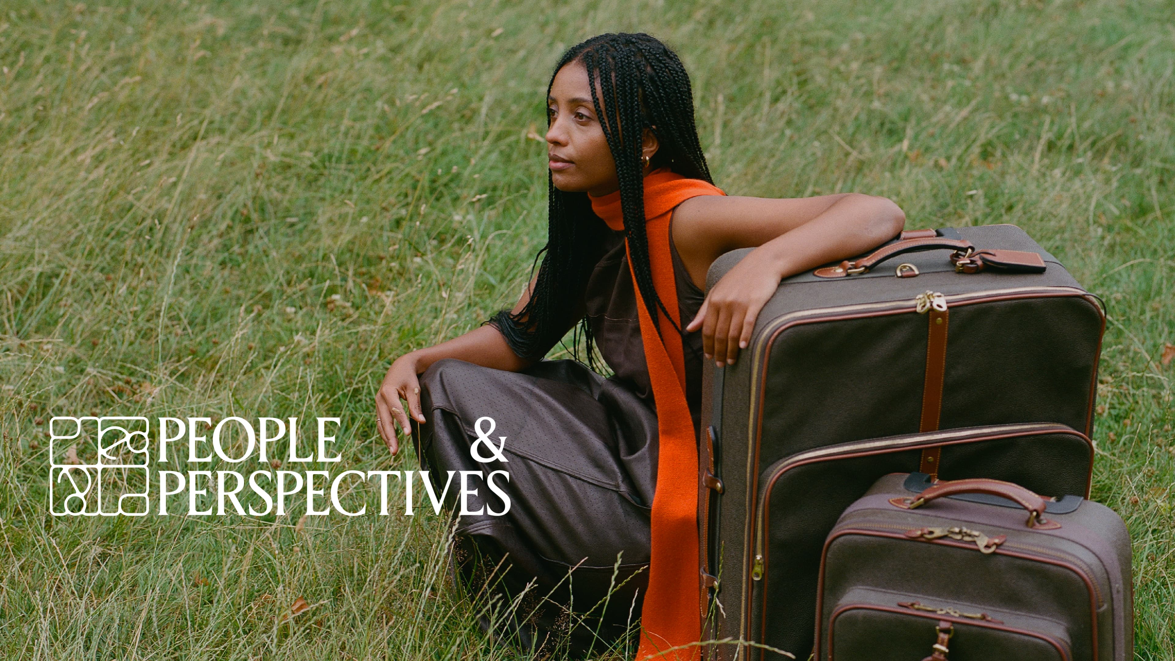
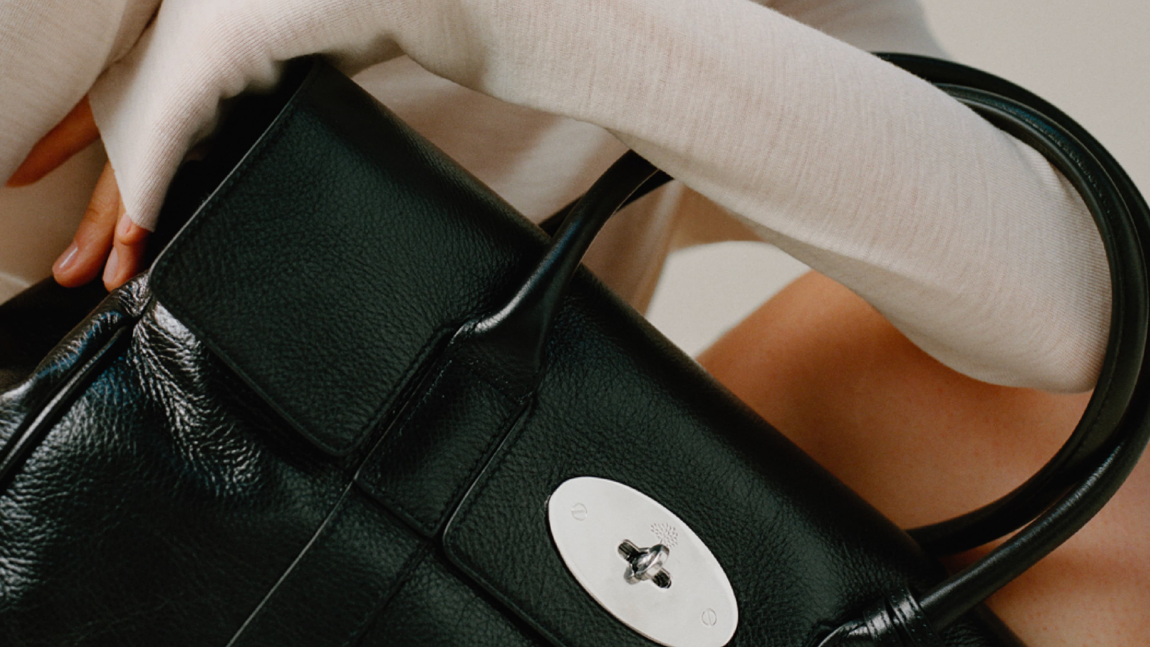
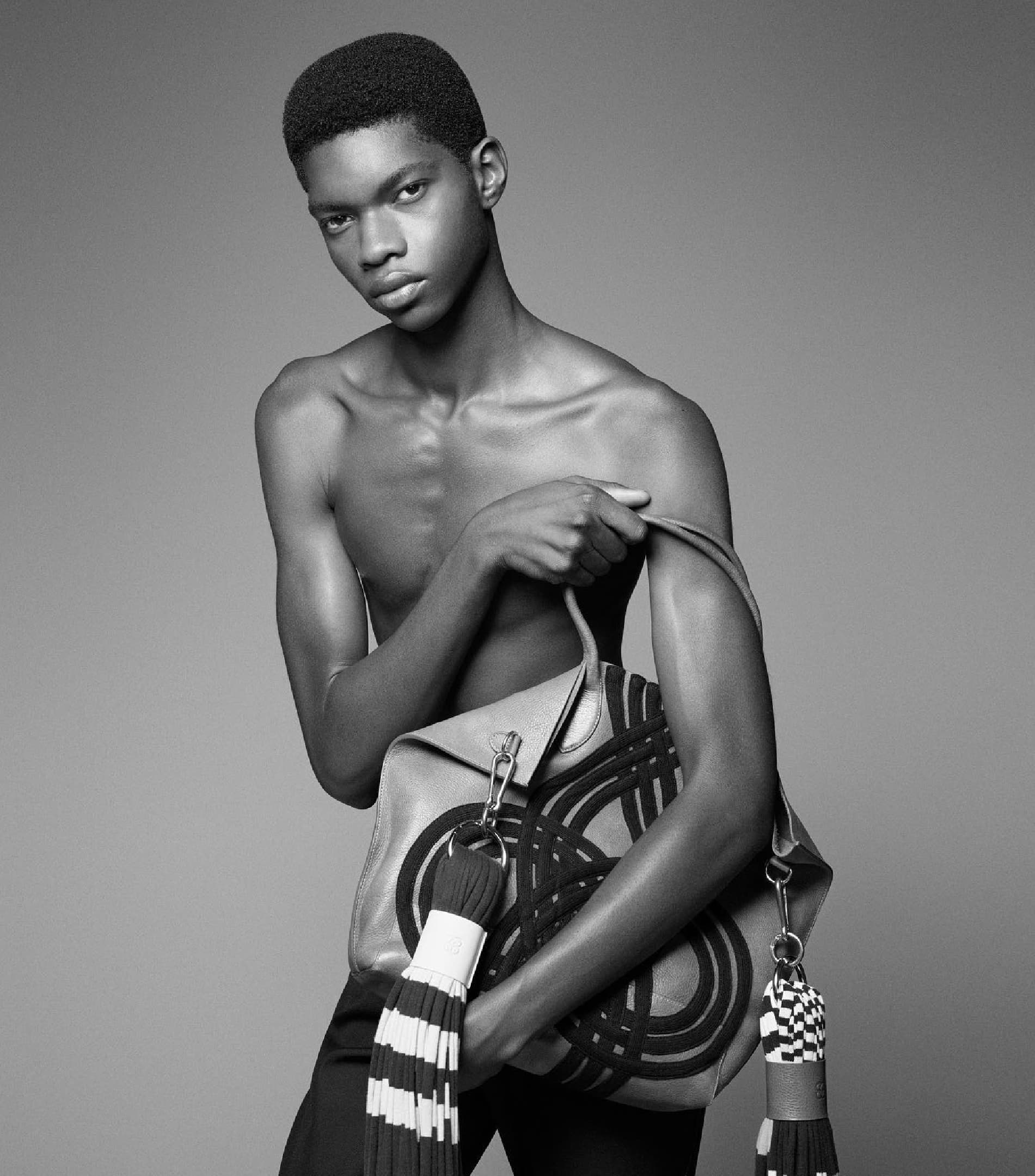
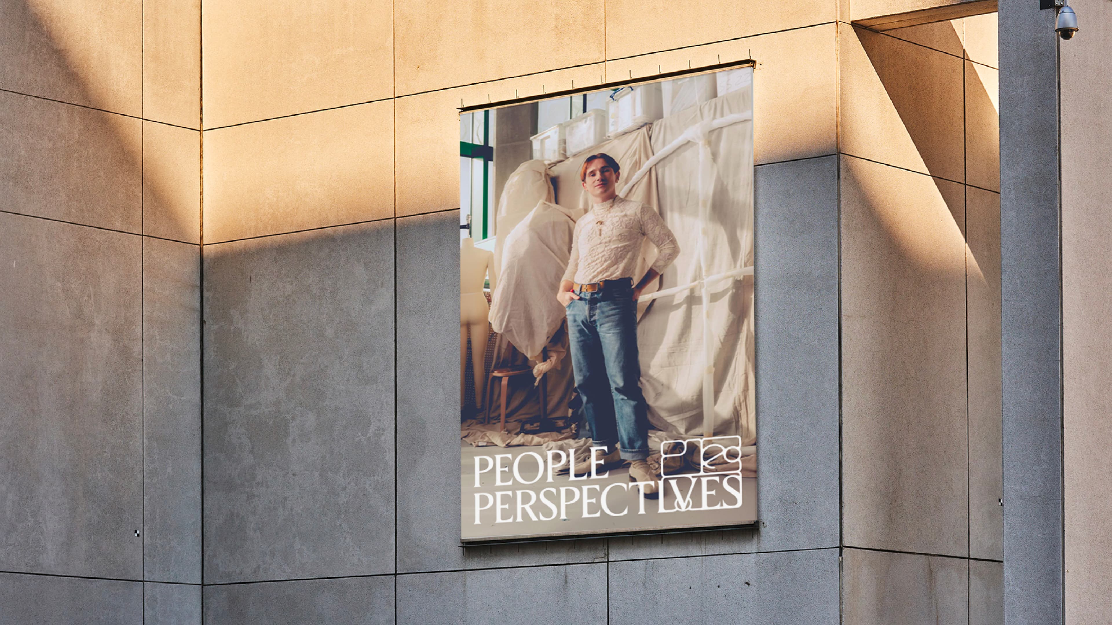
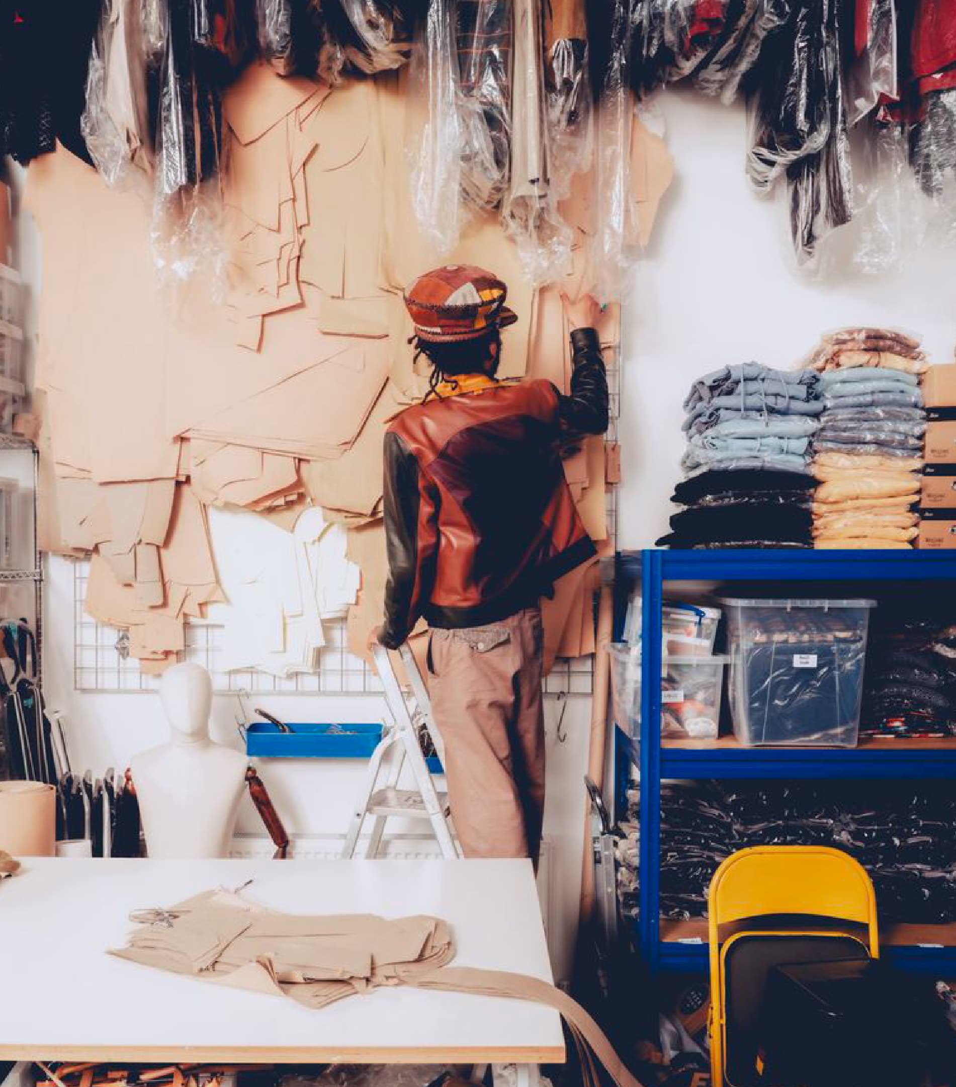
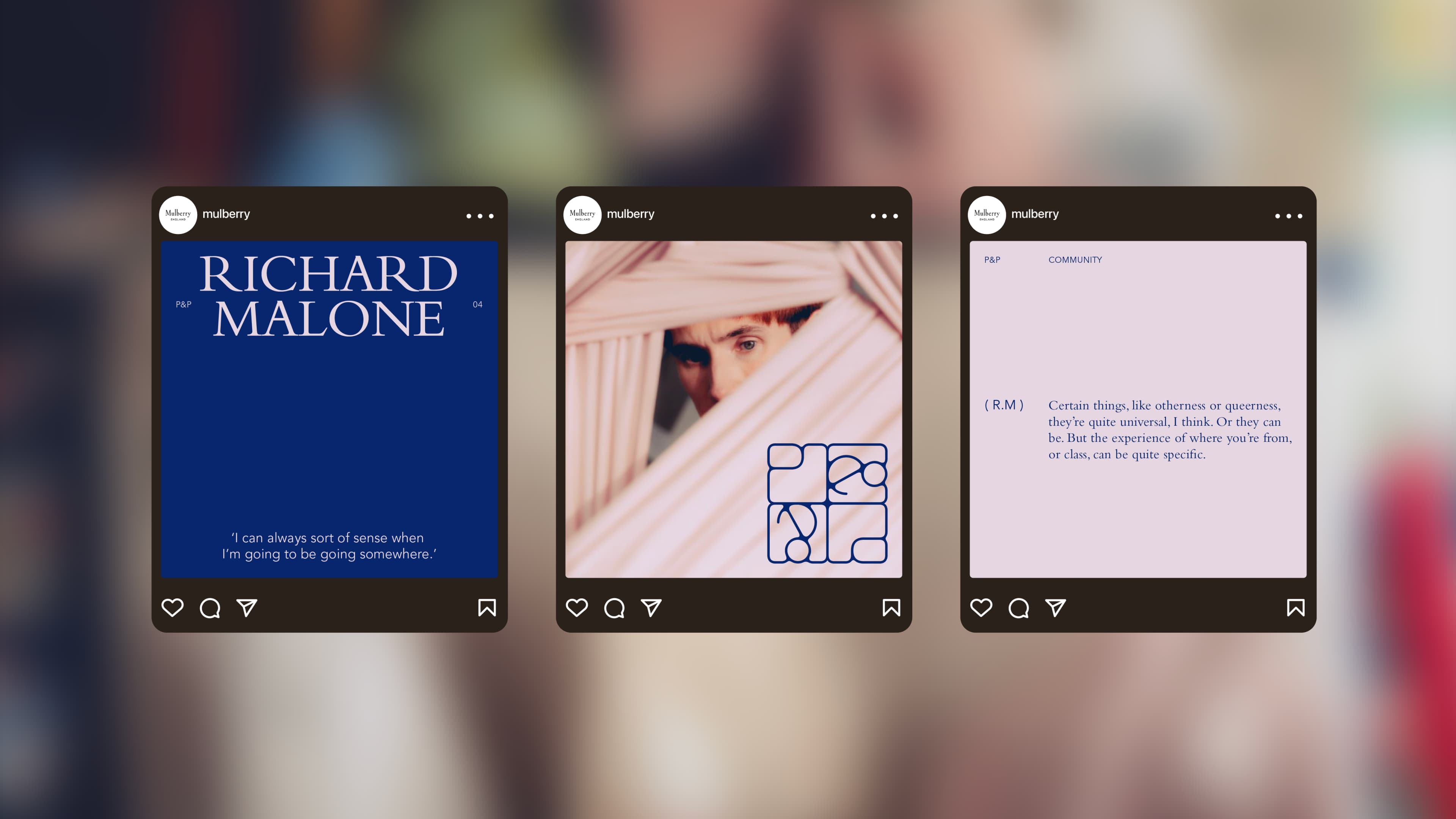
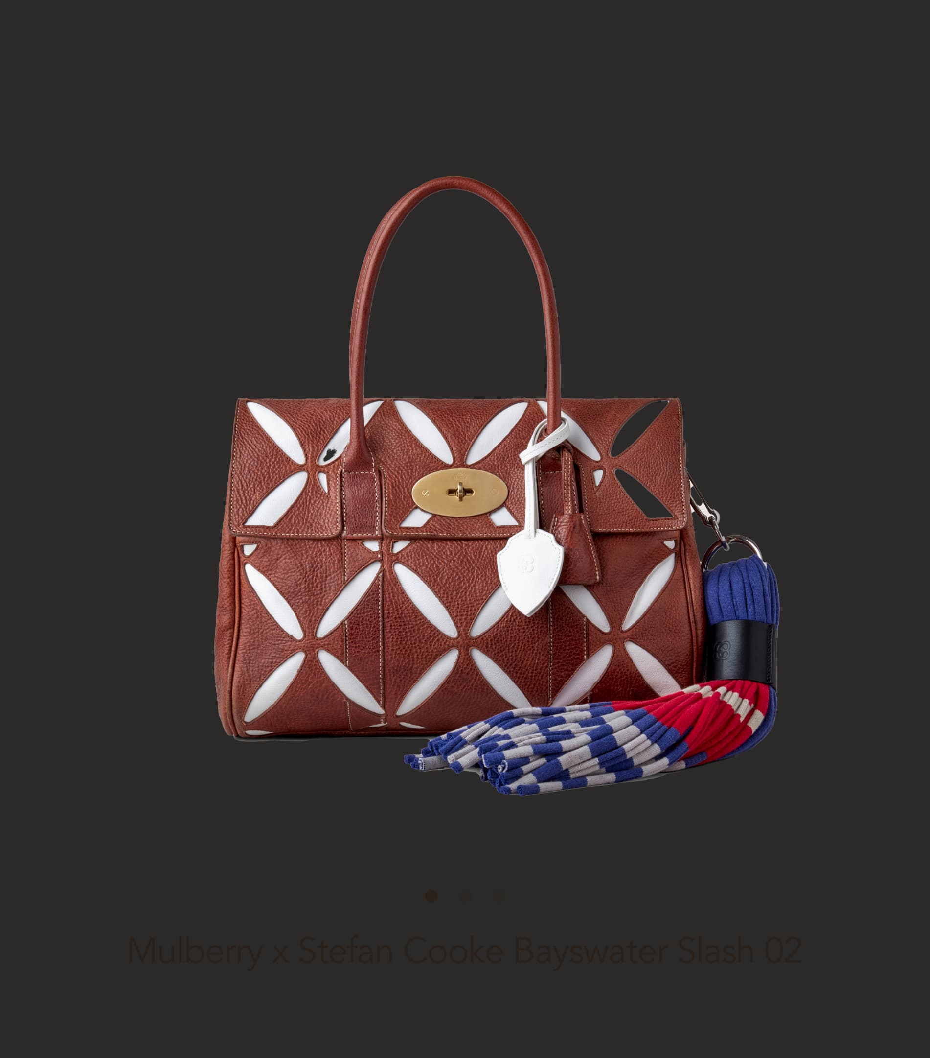
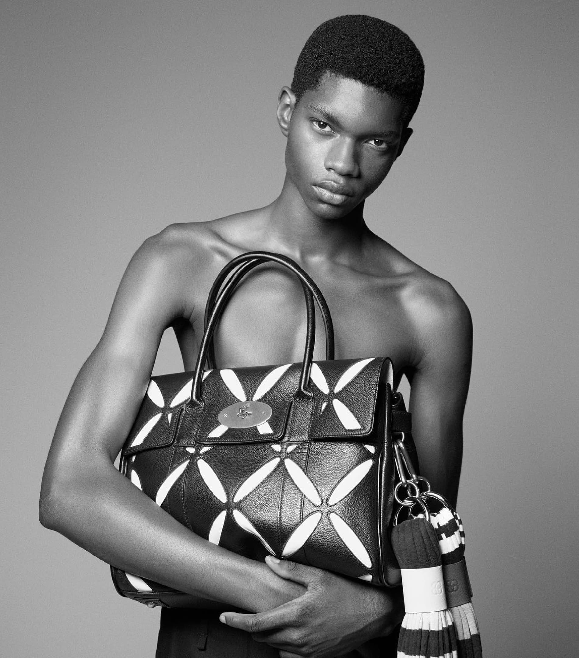
Mulberry's brand is built on British craft and heritage. "People and Perspectives" extends that into culture: a content series showcasing creatives discussing their work and inspirations. The series needed its own visual identity, distinct enough to stand alone but connected enough to sit within Mulberry's brand architecture without tension.
Unlock
The design problem is one of proximity. Too close to the parent brand and the series has no voice of its own. Too far and it stops feeling like Mulberry. The identity needed to sit in the space between heritage and editorial independence, giving the series room to feature a wide range of creative voices without defaulting to Mulberry's product-facing visual language.
Create
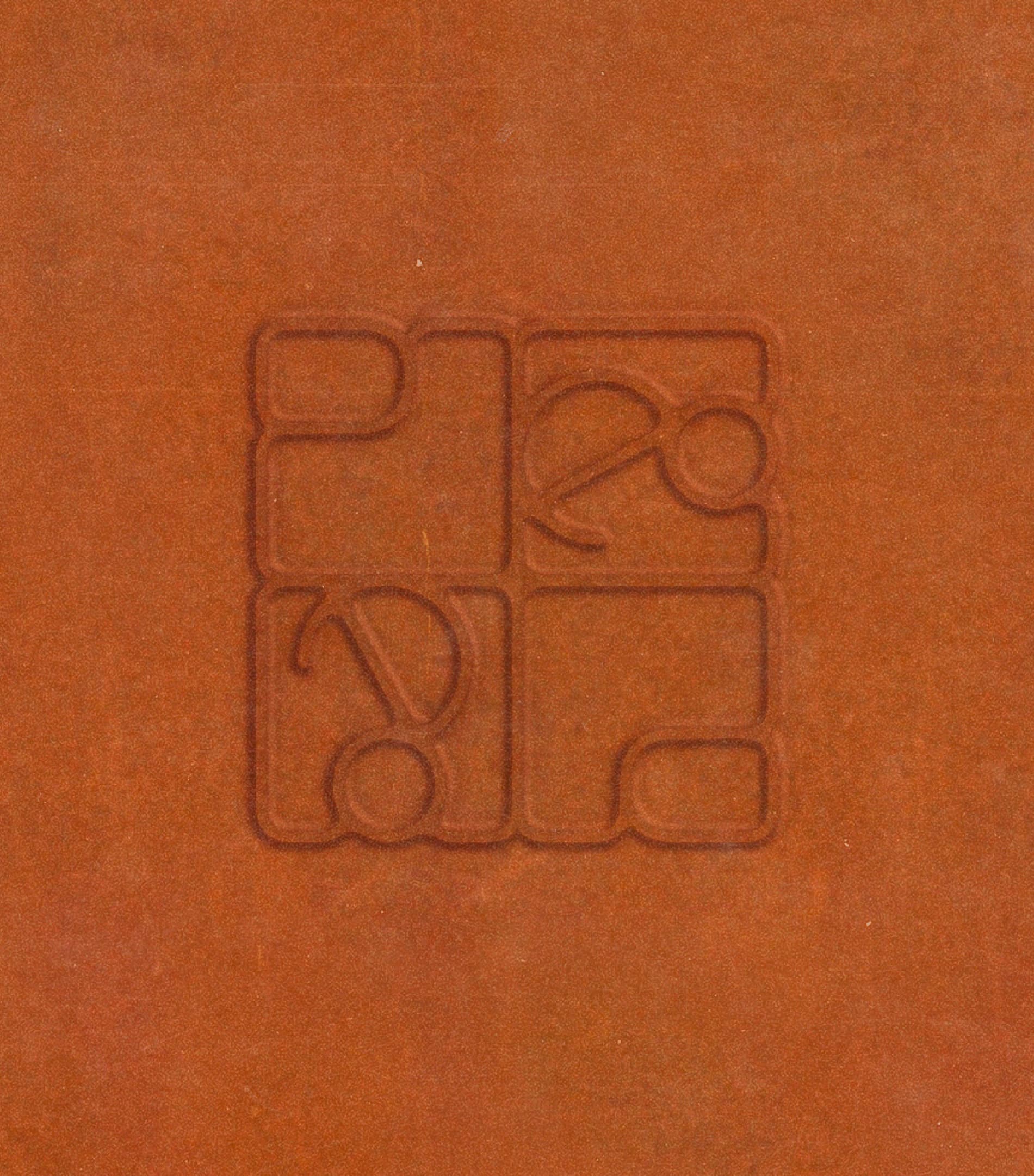
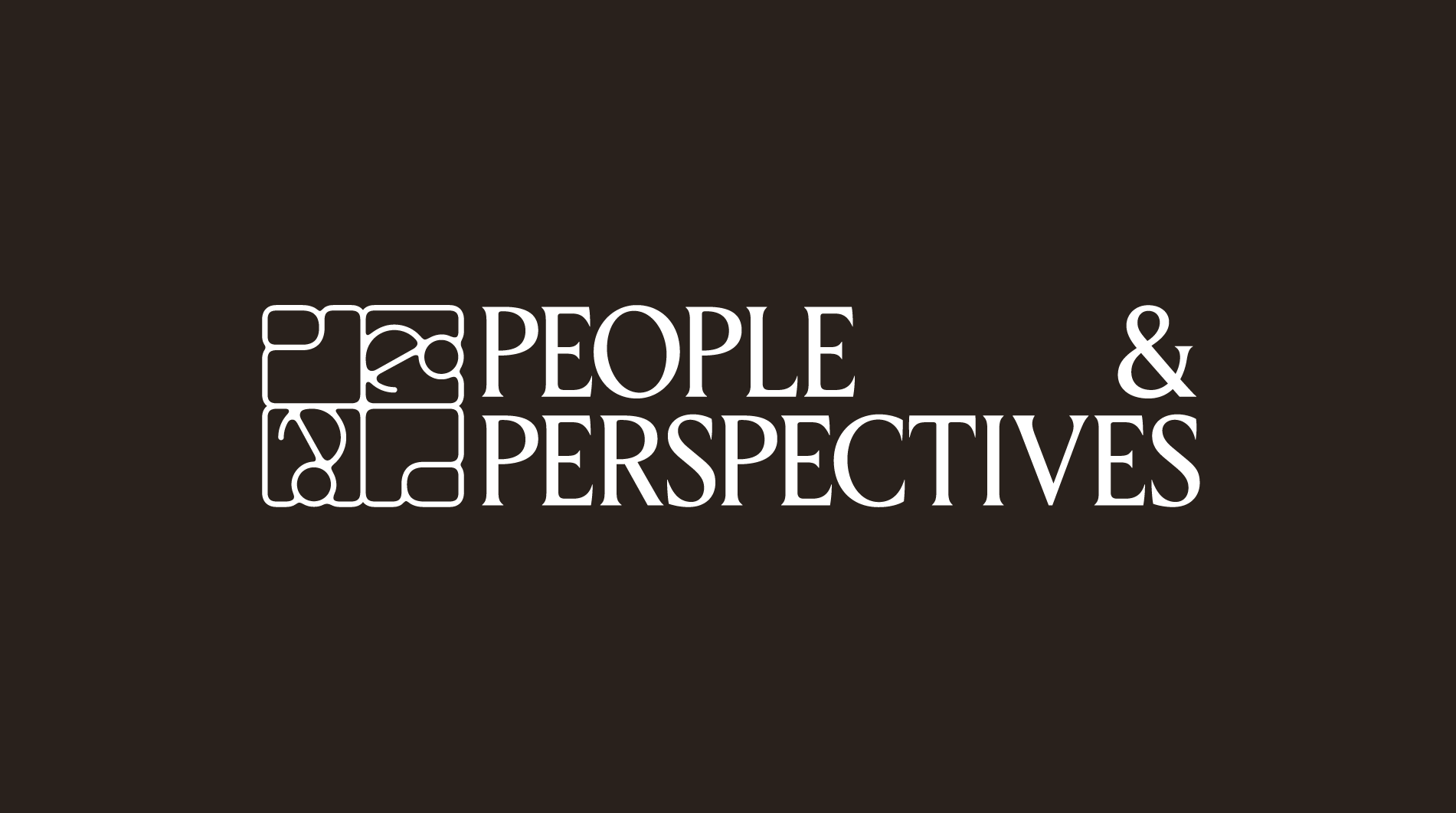
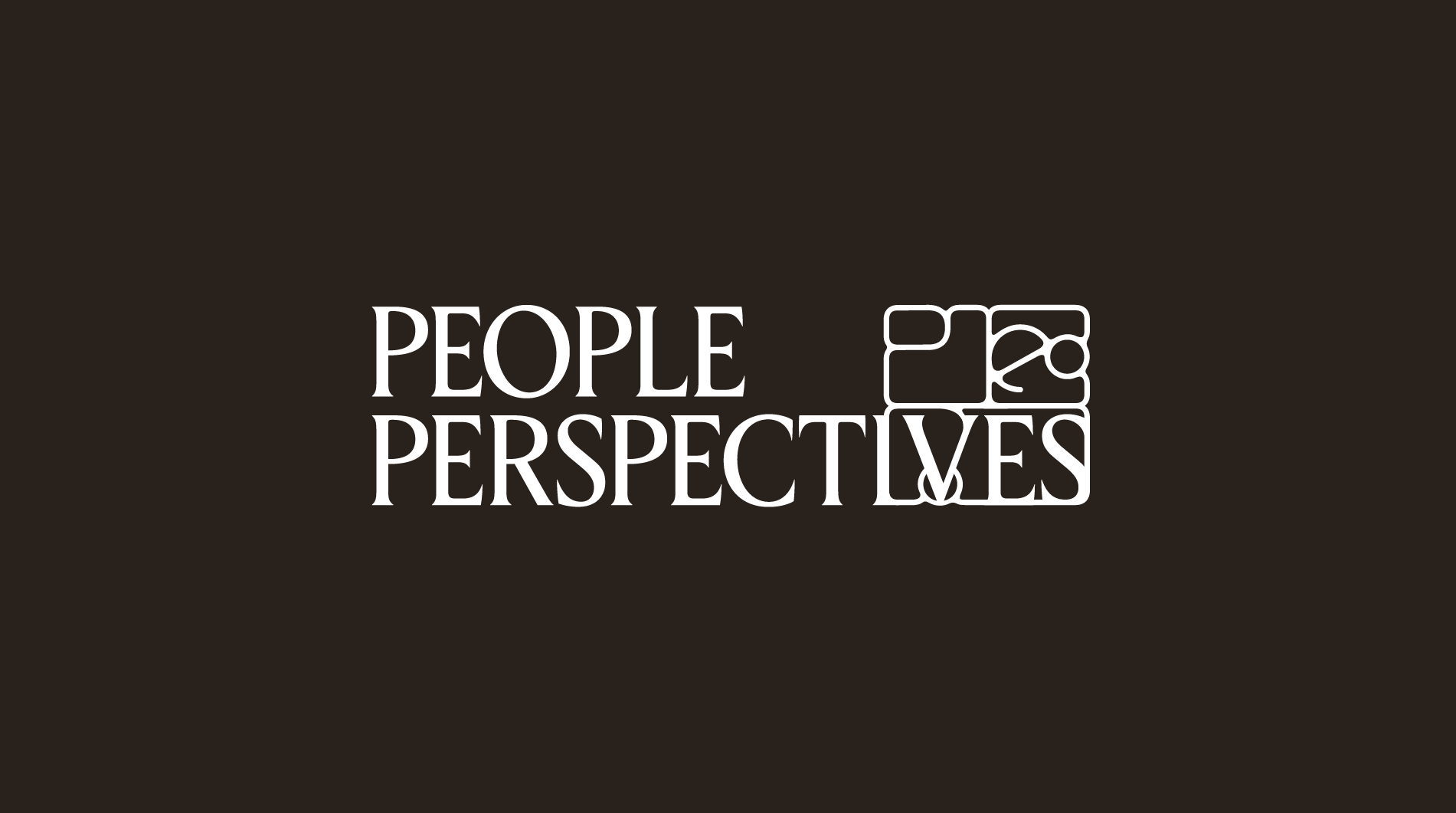
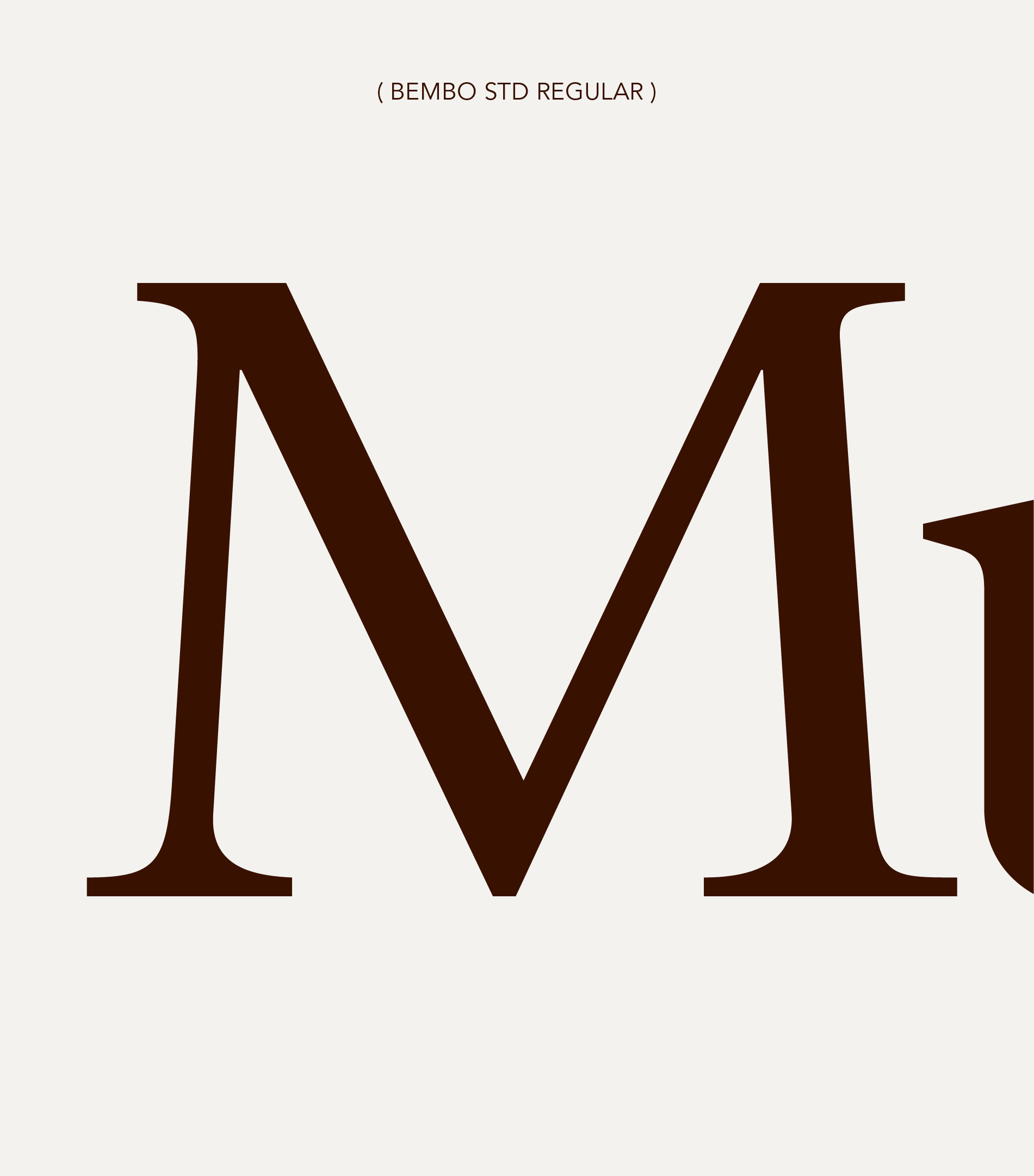
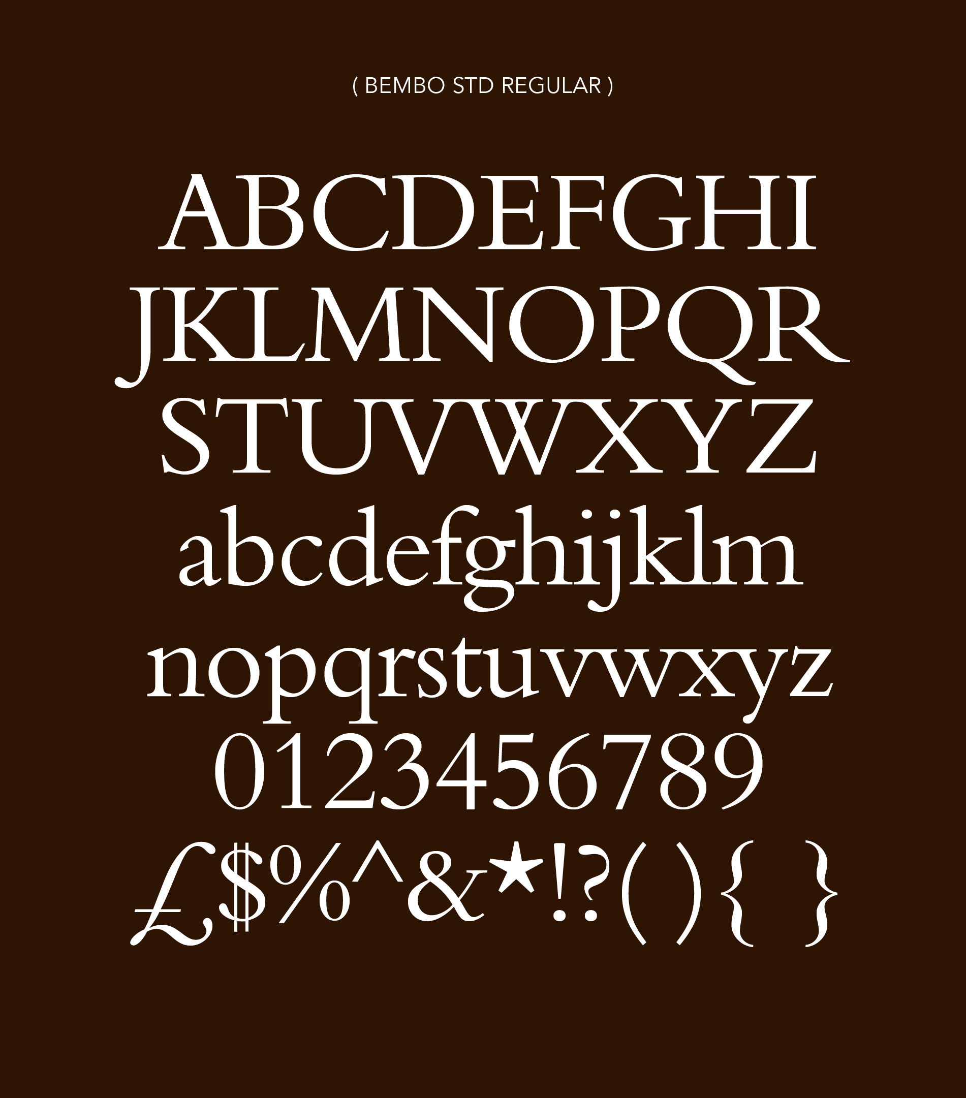
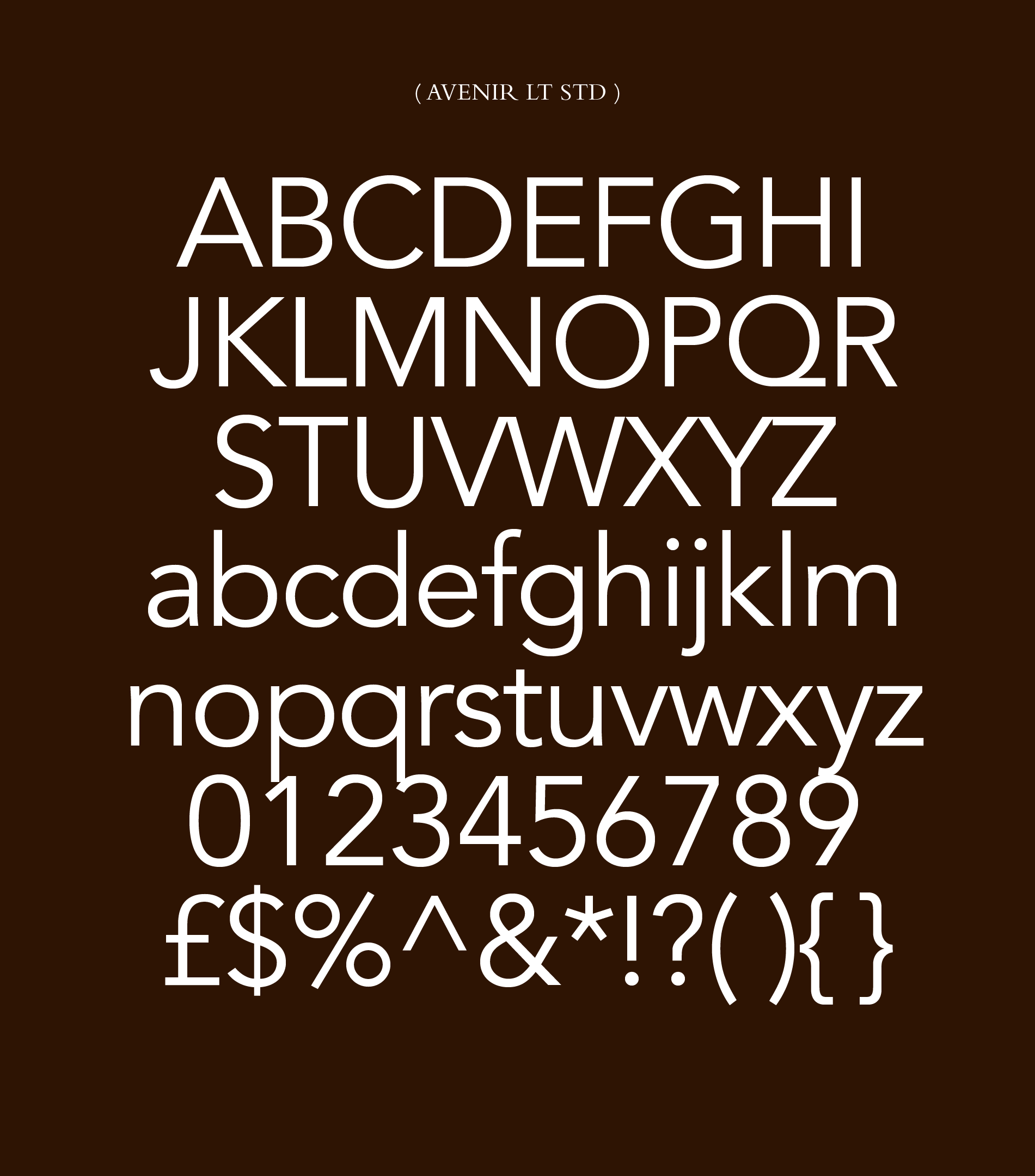
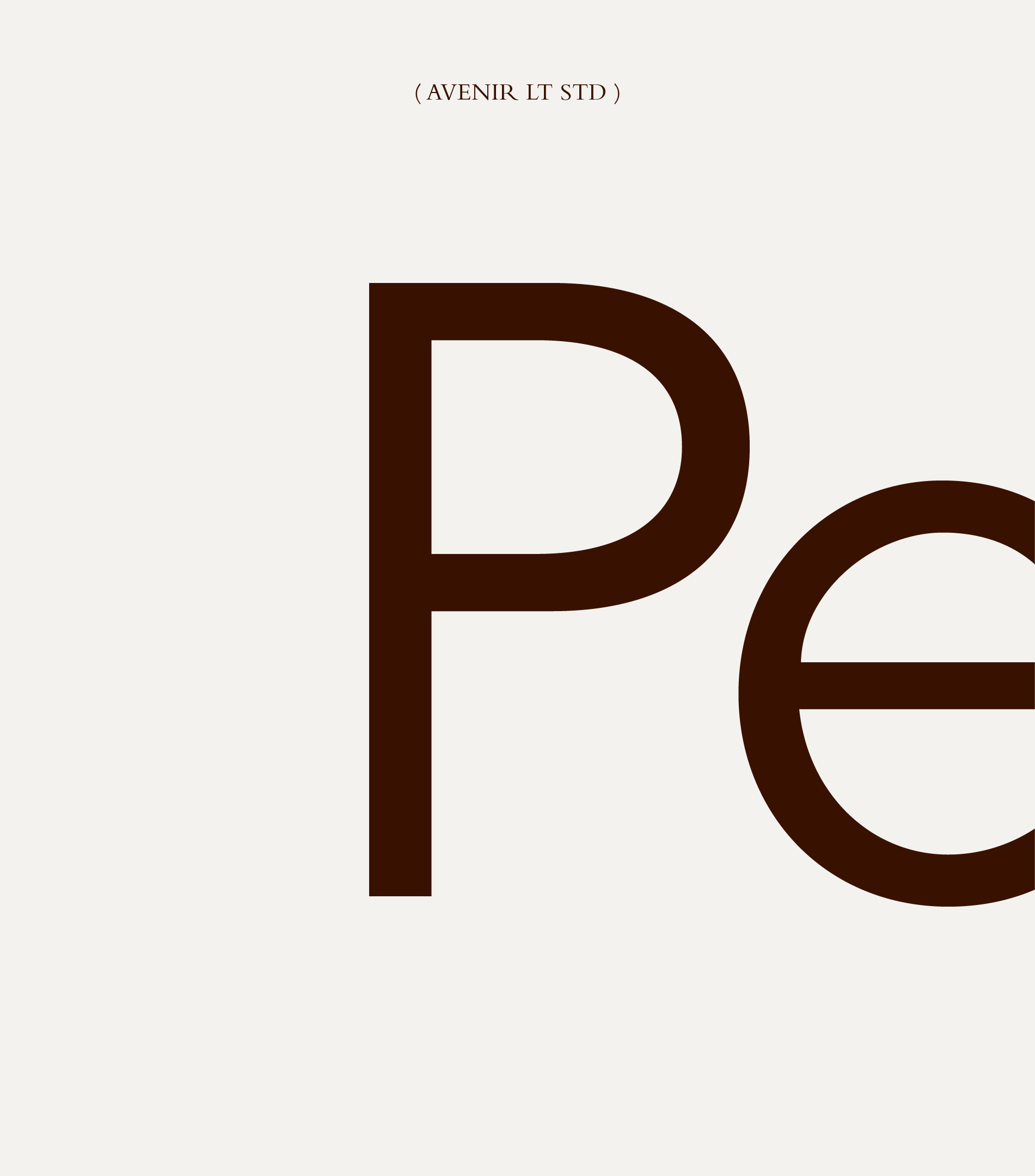
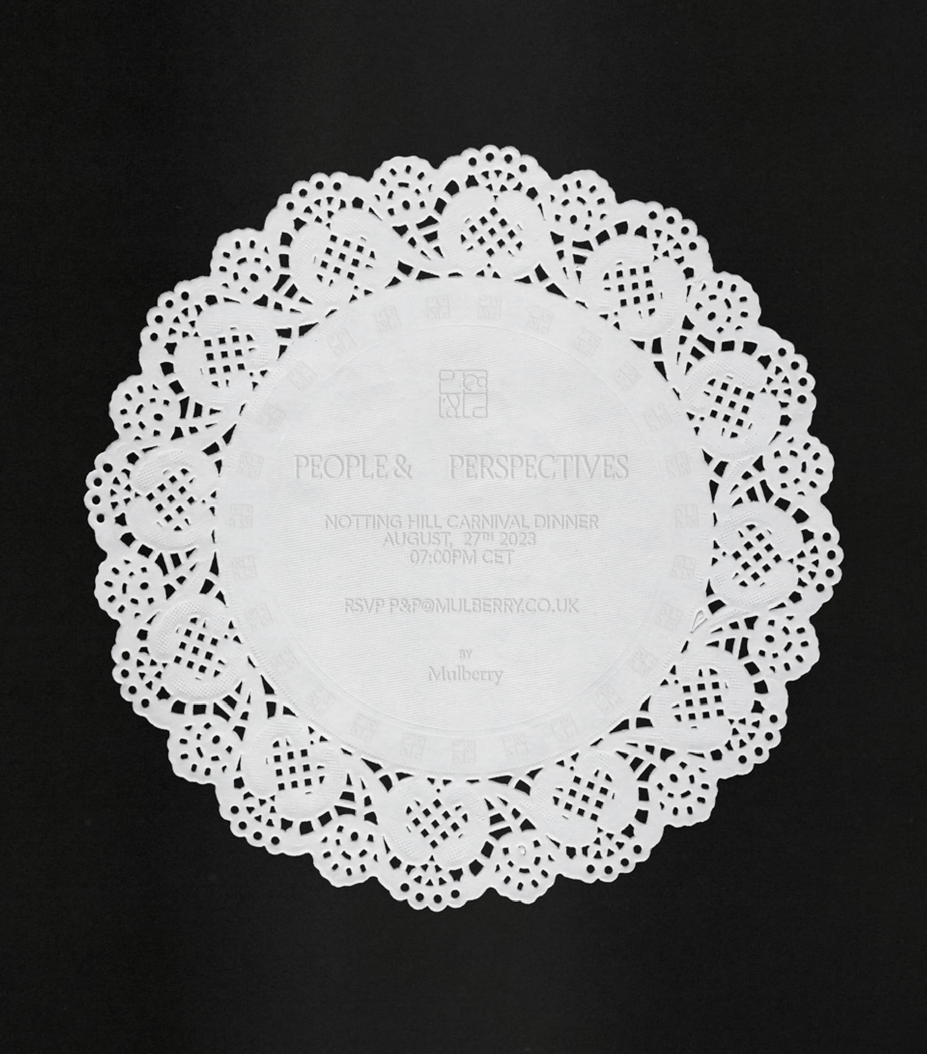
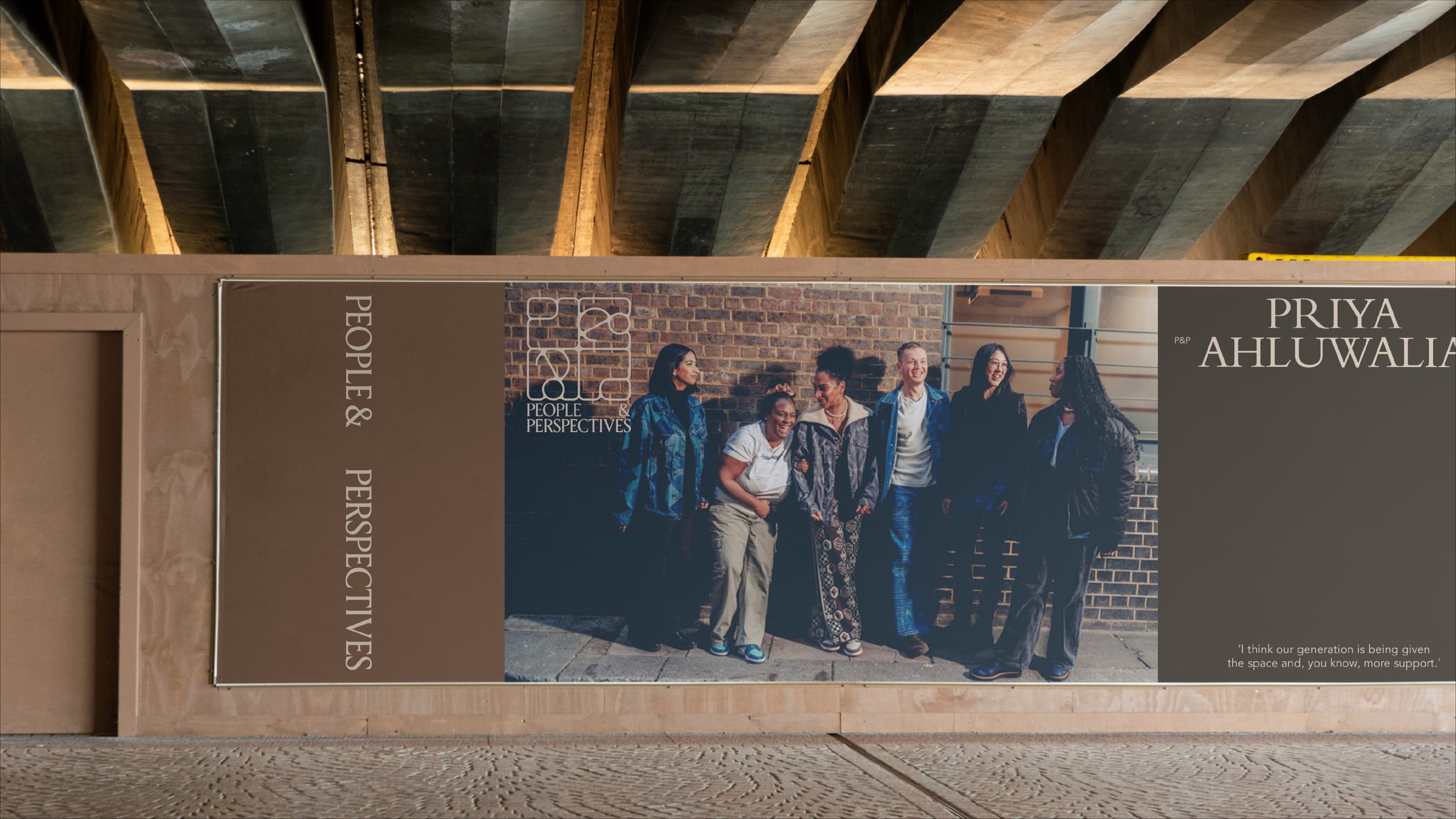
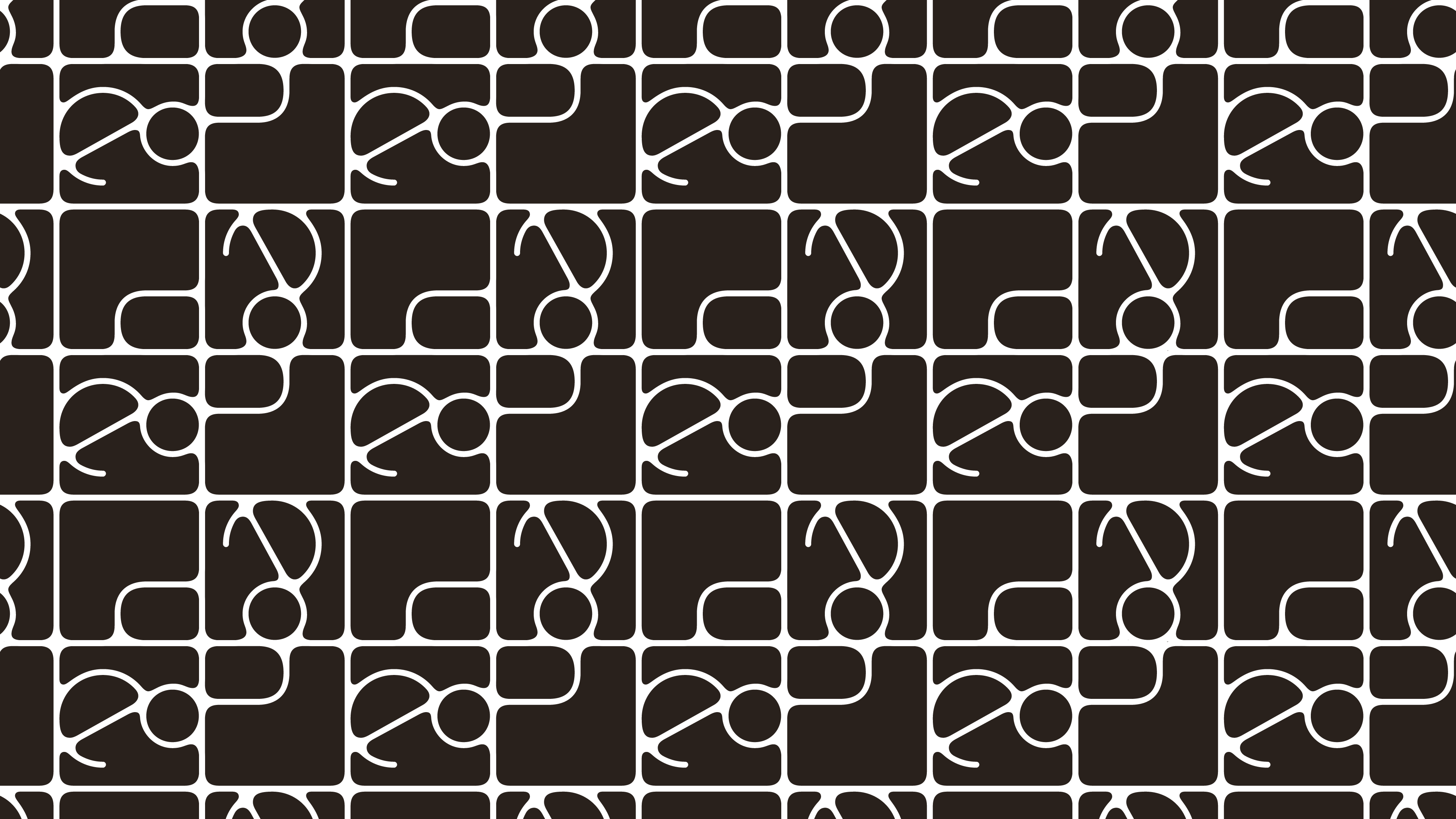
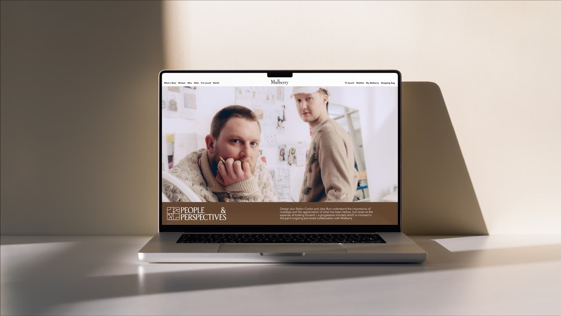
A bespoke logotype and elegant marque give the series its own presence. The typographic system uses Mulberry's existing typefaces but applies them with editorial flexibility, blending heritage elements with contemporary treatments. The identity reads as classic and considered without feeling archival. The restraint is deliberate: the visual system frames the creatives rather than competing with them.

Become
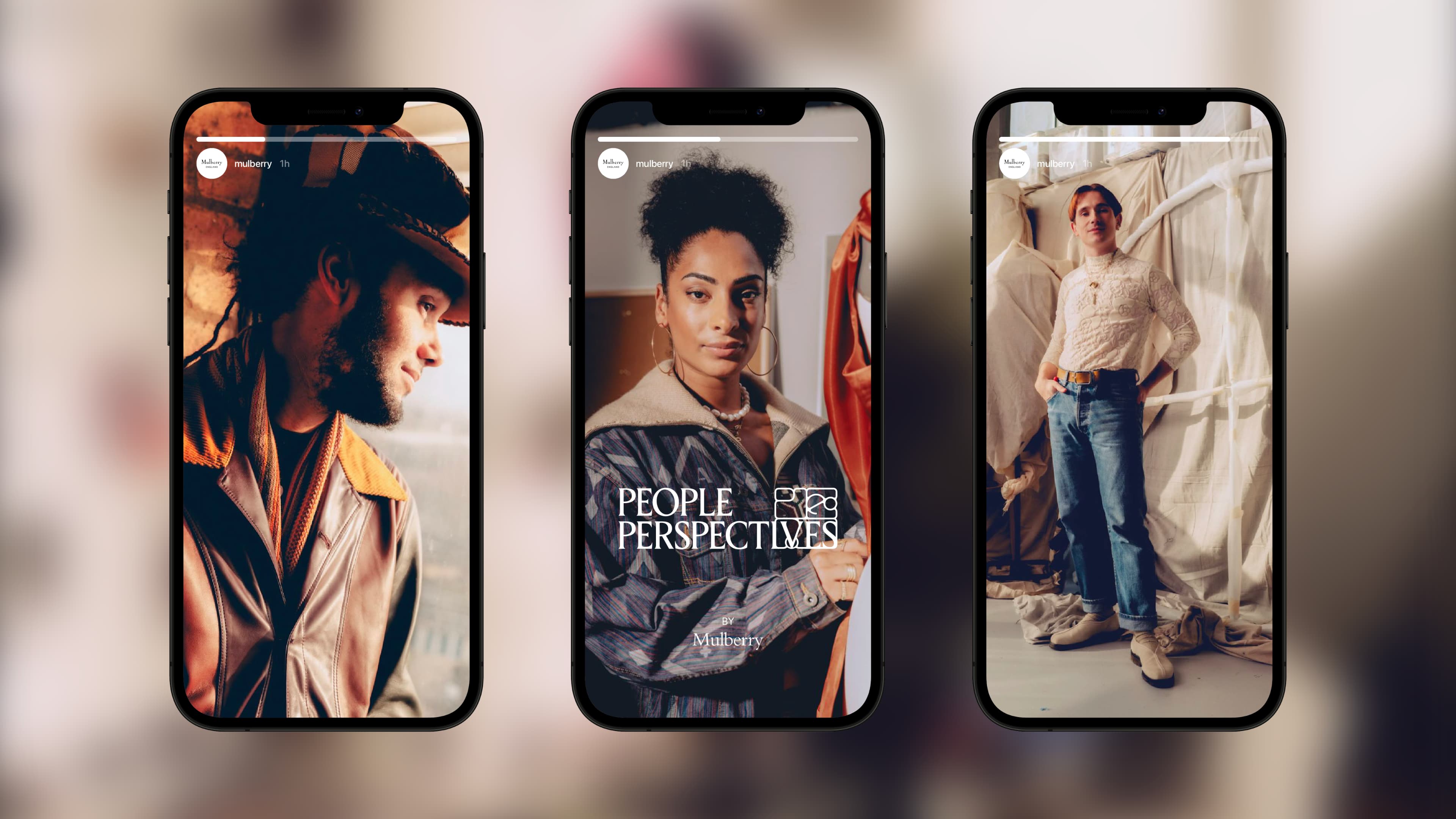
The identity launched with the series debut on social media and provides a consistent visual framework for each new episode and feature. The flexible typographic system allows the identity to adapt to different creative subjects while maintaining recognition across the series.
Unmistakably Mulberry
"People and Perspectives" gives Mulberry a distinct editorial presence that extends the brand's craft narrative beyond product. The series identity positions Mulberry within a broader cultural conversation about British creativity, giving the brand a format to engage audiences who connect with the values before the products.
Studio NARI team
Caterina Bianchini
Creative Director
Abbie Lilley
Designer
Lynn Cariou
Typographer
Teti Martinez
Art Director